Memorials for Veterans Day, Discovered by the Simmons Strategic Information Arrangement Class, November 2010

Post Tags

A lively Strategic Information Arrangement class continues this month in the Graduate School of Library and Information Science CE program at Simmons College.  The four week class looks at arrangement strategies and persuasive uses of arrangement, including a one week section about names on memorials.  For the May 2010 class, I wrote a Memorial Day blog describing memorials found by class members.  In a new tradition, today’s post honors Veterans Day with memorials found by the current class.

HARVARD MEMORIAL HALL TRANSEPT

Harvard University provides an elegant memorial to its “associates” who died fighting for the Union in the Civil War.  We learned of this memorial from Jennifer Beauregard, the university’s Assistant Director for Alumni Affairs and Development Library Services.  Located in the Transept of Memorial Hall, the 136 names on 28 wall plaques are listed by school and by class, in alphabetical order within each class.  There is one plaque out of order, but we do not know the reason for that.

The memorial’s donor specified the exclusion of names of Harvard Confederates.  In 2006, artist Brian Tolle built his “Deep Wounds” installation on the floor of the Transept, calling attention to these Harvard soldiers who also died.  As people walked across his lit floor, their footsteps created a “blister” of light behind them, revealing information about a Harvard Confederate, everything but his name.  They were organized so Union and Confederate soldiers from the same class were near each other.

This got me wondering if there are Civil War memorials honoring both sides.  Certainly other colleges and towns, especially in border states, would have Union and Confederate losses.  I didn’t find anything in brief research.  However, I did find a Wikipedia article about the Gettysburg “Great Reunion of 1913,”, which included all participants.

LONGMEADOW, MASSACHUSETS TOWN GREEN

Elizabeth Ryan, Director of Social Media at the start-up company, Textifer, found a war memorial on her Town Green in Longmeadow, MA.  She says names are arranged by war and then in alphabetical order.  Most of the names are from World War II.  Photos on the town website, and a personal communication from a town employee, indicate a separate memorial for World War I.

Many towns in the United States and Britain have war memorials.  There is even a British memorial honoring those who died from a single city block.  I remember visiting the World War II memorial in San Francisco to look at the names of my mother’s friends.  Before moving to Phoenix, I lived in Healdsburg in California’s wine country.  Just like Longmeadow, they have a small memorial in the town square for those lost in wars.

SHUTTLE CHALLENGER MEMORIAL

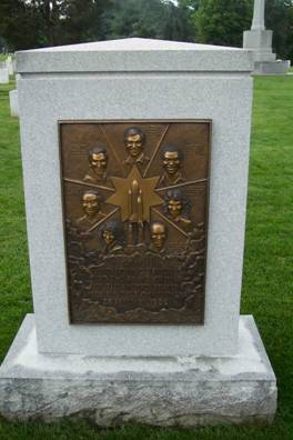
Jeanne Goss of the Research Department at the industrial supply company Grainger told us about the Shuttle Challenger Memorial (pictured) at Arlington National Cemetery.  This is a small memorial, a headstone really, marking the unidentified remains of the Challenger’s crew.  Identified remains were returned to their families.  This has a persuasive element in that the names are arranged in a circle, a geometric shape emphasizing equality.  Yet the names are actually in a complex ordering.

According to a personal (and very fast) communication from NASA, there is only one crew leader, the Commander, and everyone else is equal.  However, it is my observation that the Challenger crew names are frequently listed in the same order:  Commander, Pilot, Mission Specialists in alphabetical order, and civilians in alphabetical order.  This is how they are listed in the Challenger Center for Space Science Education, founded by families of the crew, and how they are listed in official NASA biographies.

However, that is not how they are arranged in the official photograph.  The Commander is in the center first row, with the Pilot at his right hand.  The first Mission Specialist sits at his left, with the remaining four in the second row but not in the above order.

The arrangement in the photograph is partially repeated on the memorial.  Commander Dick Scobee is at the top with Challenger pointing at him like an arrow.  At his right (our left) is the Pilot, Michael Smith.  As in the photo, Mission Specialist Ron McNair is at Scobee’s left.  Then below Smith, the remaining four crew members are listed counterclockwise as described above:  Mission Specialist Ellison Onizuka, Mission Specialist Judy Resnik, civilian engineer Gregory Jarvis, and civilian teacher Christa McAuliffe.  The artist used several elements to select placement for each name, yet the circle creates a primary impression of equality, which is how NASA organizes its crews.

Correction:  I originally wrote this on Veterans Day weekend, which impeded researching primary sources.  However, on Veterans Day, after I posted, I received a response from Cheri Winkler of the Challenger Center for Space Science Education.  She had asked Dick Scobee’s widow, June Scobee Rodgers, about the name arrangement.  Here is Dr. Scobee’s response:

“Fascinating question.  Commander Scobee, then pilot Mike Smith is right.  The three mission specialists are alphabetized, then the payload specialist Jarvis, the private citizen Christa.  If it were based on position of job on crew, Judy Resnik would come first of the 3 mission specialists.”

VENDOME FIREFIGHTERS MEMORIAL

A strategy emphasizing different characteristics is taken by Boston’s Vendome Firefighters Memorial, found by Andrea Goodman, Senior Information Specialist at the economics consulting firm Cornerstone Research.  This semi-circular wall honors nine Boston firefighters who lost their lives fighting a 1972 fire in the Vendome Hotel.  It is the largest number of Boston firefighters to have died in a single incident.  The hotel can be seen above the memorial’s arc.  At that point rests a realistic sculpture of a helmet and jacket, “lying as if left there by a firefighter on the day of the fire.”

On the memorial, the nine names are listed in alphabetical order, expressing equality.  However, on the memorial’s website, the names seem to be listed in hierarchy of rank, with the two lieutenants first.  Then in the PDF program for the dedication, they are in a chronology of service, by date of entry into the Boston Fire Department.  There is honor in length of service, and there is honor in having a higher rank, just as it often appropriate to show equality.  The developers of this memorial gave us all three.

GUILFORD NATIONAL MILITARY PARK

Lists of names are a relatively new development in memorials due to our increasing respect for enlisted personnel and our better record keeping.  For many centuries, memorials were statues of great military leaders.  That is the strategy of the Guilford Courthouse National Military Park in Greensboro, NC, discovered by Mary Lane, a Library Manger in that city.  The site of a Revolutionary War battle, its centerpiece is a massive statue of General Nathaniel Greene on his horse.  Persuasive use of size and location convey the impression that this is an important man and an important place.

There are many other memorial structures in the park.  The idea was to locate these on the sites of actual battle events.  Organizing information by location, whether on the land itself or on a website, is a geographic arrangement, but there’s a hitch here.  Like the Alamo, where they destroyed an historic building to make the area more beautiful, the Guilford Courthouse is a park not an accurate historic site.  For one thing, early promoters were not able to acquire all the land, so they redesigned the battle to fit the land they did have.  Current park policy is to relocate these errant memorials to their accurate locations, but some are too big for that.

IRISH HUNGER MEMORIAL

The Irish Hunger Memorial in New York City, discovered by Meghan Sullivan, a Knowledge Management Information Architect with the Kaplan education company, honors the millions who died in the Great Irish Famine of the 1840’s or who emigrated from Ireland, many to the United States.  A low cantilevered roof on a half acre, it is landscaped to look like the Irish countryside, complete with an actual hut from that era.  You enter or depart the hut though a hallway with streaming illuminated quotations about hunger, both during the Famine and in our modern times.  Meghan’s observations, along with a New Yorker review, indicate these quotes appear at random.

The rooftop garden contains large stones engraved with names of Irish counties.  There seems to be an arrangement here, but we have not determined what it is.  A PDF brochure lists counties in alphabetical order and shows their locations with a numbering system.  However the numbers do not relate to the alphabet nor are they contiguous on the map.  They also don’t relate to the counties’ locations in Ireland.  I found a map showing population changes during the Famine, and that doesn’t seem to be it.

Perhaps the arrangement is explained somewhere at the memorial, but the map would be a good place for this description.  While there is a grand tradition of written reviews, we usually don’t explain art at the site of the art itself.  We expect the viewer to create their own impression from the cues given by the artist.  One’s interpretation of the piece may be quite different from what the artist intended and that’s acceptable and encouraged.

But arrangement is different from other artistic elements.  If not articulated, a structured arrangement exists only in the artist’s mind.  As part of artistic display, organizational choices contribute to our understanding.  But if there are no cues, we have a guessing game, especially when choices are complex.  (See my article about the Wittenbergplatz Holocaust Memorial for another example of an unexplained arrangement.)

At the Irish Hunger Memorial, someone made a decision about placing stones and about assigning numbers unrelated to that placement.  The reasons are not explained.  Our understanding of the memorial, and our thoughts about hunger, would be enhanced if this artistic element was made visible.

For this article, I also made arrangement decisions.  Following the example of the Shuttle Challenger Memorial, I created two categories – memorials with and without names.  Since the unit is primarily about how names are arranged on memorials, I placed that category first.  Within each category, the memorials are in alphabetical order.

It took me a paragraph to explain my strategy, one reason perhaps why artistic arrangements are not often explained.  But that could easily be shortened, especially if we assume certain organizing structures, such as the alphabet, are obvious.

Arrangement:  Memorials with names, Memorials without names

Thank you to those who served our country in war, in fighting fires, and in exploring new territory.  Thank you to the immigrants who gave so many of us a place in this great country.  Thank you to those serving us today who, with great sadness, will one day be memorialized.

Photo Credit:  Shuttle Challenger Memorial by M. R. Patterson


Print pagePDF pageEmail page
11
Nov 2010
POSTED BY
DISCUSSION 0 Comments
TAGS

Arranging to Persuade: Tunneling or Guided Persuasion

Long Tunnel

Fogg’s Principle of Tunneling:  “Using computing technology to guide users through a process or experience provides opportunities to persuade along the way.”

            This month we take a journey to tunneling in our series on B. J. Fogg’s seven tools of persuasion from his book Persuasive Technology:  Using Computers to Change What We Think and Do.  Fogg cites software installation as a tunnel.  That frequently involves staying near the computer and answering questions every so often.  You are a captive audience as the installation proceeds.  As such, you may experience promotions for other products or about the benefits of your new purchase.  You and the company share a journey of software installation, with the company selecting the sights along the route.

              In his narrative, but not in his Principle, Fogg defines a tunnel as a committed journey, like an amusement park ride.  Once you sit in that gondola (or begin software installation), you’re committed to the entire journey.  In information arrangement, tunneling encompasses a wider definition.  You are enticed along a journey that you may or may not complete.  At any point you may decide what you are looking for is not worth the effort, or you may complete the journey, ending it only when you find what you are looking for.

One example of persuasive tunneling is the arrangement of a grocery store.  Many people pop into the store just for a quart of milk.  Milk sometimes goes bad suddenly so you pick it up on a quick errand.  That’s why milk is always at the back of the store.  If it was at the front, you would buy that one item and head on home.  When it’s at the back, you travel through the store aisles, experiencing other products and perhaps buying something else.

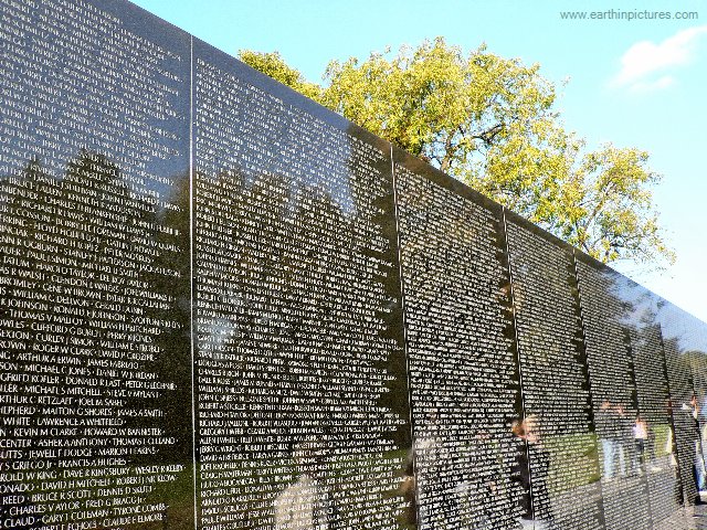
The Vietnam Veterans Memorial (VVM) provides a more complex tunnel.  Its 140 panels increase in height from 8 inches at the ends to over 10 feet in the center.  Names are inscribed in chronological order by date of casualty and alphabetical order within each day.  So it would seem that visitors take a journey from the beginning of the war to the end.

That is the case, but the journey actually begins in the center.  Maya Lin wanted the VVM to symbolize a circle so the names begin and end at the tall center panels, indicated by the only two dates on the Memorial, 1959 and 1975.  No other dates appear.  Walking along the panels, the only indication of a new day is the beginning of a new set of names in alphabetical order.  Even though this is the journey of the Vietnam War, it does not feel like a persuasive tunnel, since we only see a massive display of names.

Many visitors believe the chronology begins at the short left panel.  That’s logical since we read from left to right, not from the center to the right to the left and back again to the center.  When we experience the VVM from left to right, the shape of the memorial helps us feel the shape of war.  A few deaths at the beginning, building to a crescendo at the center and winding down to just a few names at the end.  In this case, because we know the names are in chronological order, the shape of the VVM creates a journey along the panels, persuading us to experience feelings about the progression of war.

Illustration used with permission from Microsoft.


Print pagePDF pageEmail page

Arranging to Persuade: Reduction or Persuading through Simplifying


Last month I introduced B J Fogg’s seven tools of persuasion as outlined in his book, Persuasive Technology: Using Computers to Change What We Think and Do.  I showed how information arrangement exploits these tools with specific reference to the Vietnam Veterans Memorial (VVM).  The VVM arranges its names in chronological order by date of casualty, grouping together soldiers who served at the same time.  In so doing, the memorial demonstrates six of the Fogg’s seven persuasive tools.  This month, let’s take a deeper look at the first tool, Reduction or Persuading through Simplifying.

Reduction strategy is all about cost/benefit analysis.  How much effort (cost) achieves the benefit?  Fogg describes Amazon’s 1-click ordering method as pure reduction.  Before
this innovation, every click in the online sales process was a chance for customers to change their minds.  Will they go on to the next buying step or will they give up and click over to anotherWebsite?  At Amazon, one click seals the deal.  If a mind changes later, there’s a new cost/benefit analysis for the effort involved in cancelling the order.

Many years ago, when Ma Bell stopped being our only telephone company, the new phone services battled mightily for customers.  It became very easy to change your long distance company.  One brief request and it was done.  Sometimes you didn’t even have to bother with the request.  Sign your name to some freebie promo and you might find out later that the small print was an agreement to change phone services.  One step and it didn’t even involve thinking about phones.

Maya Lin’s VVM is a more honorable example of reduction, but her controversial proposal almost didn’t get approved.  Among many complaints about Lin’s design was the chronology, which requires the use of an index to find an individual name.  Critics wanted the names on the VVM in alphabetical order, making the memorial itself a giant index. 

MIT’s John Maeda, in his book, The Laws of Simplicity, assigns organization as the second law.  Organizing arranges similar items together and simplifies our efforts to use them.  Alphabetical order on the VVM would have made it easier to find a single name, but much harder to find a group of names.

First, a vet would have to remember names from more than 30 years ago.  Then he would have to look up each name individually, walking along the panels from A – Z.  To prepare for the effort, he might alphabetize the names of his dead buddies, the ones he remembers, so he doesn’t have to move back and forth among the 144 panels.  The names near each lost friend would have no meaning other than an alphabetic
similarity, or even the same name in some cases.  Names he can’t remember would remain forgotten.  The primary memorial activity here is similar to using a print dictionary, an exercise in the alphabet rather than an emotional experience of memory.

Chronology reduces the effort and increases the depth of feeling.  The vet only has to remember one name.  He finds that name in the printed index and goes to a panel representing the time he spent in Vietnam.  There are all his friends who died or went missing.  If he can’t remember someone’s name, the memorial remembers for him.
They are together again, the vet seeing his reflection in the polished marble among the names of those he lost.  The next time he visits, he won’t need the index.  He’ll know where to find his friends. 

Illustration used with permission from Microsoft.


Print pagePDF pageEmail page

Arranging to Persuade: Seven Persuasive Tools


The Vietnam Veterans Memorial (VVM) is arguably the most powerful memorial in the world.  Maya Lin’s choice of chronological order for name arrangement may be the primary element of that power.  In making that choice, she engaged six of the seven persuasive tools identified by B J Fogg, in his book, Persuasive Technology:  Using Computers to Change What We Think and Do.  Along with technology, Fogg’s tools explain the persuasive aspects of information arrangement.  He defines a persuasive technology tool as one “designed to change attitudes or behaviors or both by making desired outcomes easier to achieve.”  He further divides these into macrosuasion and microsuasion.  The only purpose of a macrosausive tool is to persuade.  For example, the museum exhibit and computer game HIV Roulette persuades players to practice safer sex.

Microsuasive tools are the persuasive components of technologies whose primary purpose is other than persuasive.  The primary purpose of the VVM is to honor those who died or went missing during that war.  The chronologic arrangement changes the attitude and behavior of visiting Vietnam vets by allowing them to experience their time of service as they stand in front of the names of their lost buddies.

Information arrangement is almost always microsuasive.  Following are Fogg’s seven tools with an explanation of how the VVM uses them.  This is an article about arrangement, so I will mention that the tools appear in the same order in which they appear in Fogg’s book.

1)  Reduction:  Persuading through Simplifying  

People are more likely to complete a simple task.  Amazon offers“one-click” sales.  Press the key once and the sale is complete.  You can change your mind after that, but it’s a hassle.  If the names on the VVM were in alphabetical order, each name would have to be remembered and found individually.  But with chronology, a vet need only retrieve one name from his decades of memory.  The printed index shows where that name is on The Wall, surrounded by others who died on the same day, in the same battle.

2)  Tunneling:  Guided Persuasion 

In the journey of software installation, with a captive audience, the producer may demonstrate product features or try to sell more software.  The VVM also takes us on a journey.  Symbolized as a circle, the chronology begins and finishes in the center of the memorial.  Panel sizes, small at the two exteriors and huge in the center, encourage the view of a journey into a war that started small and grew and eventually ended.

3)  Tailoring:  Persuasion through Customization 

Shopping sites customize the buying experience by offering products based on previous purchases.  The VVM’s chronology gives each surviving Vietnam vet a personal place of remembrance on the memorial.  The names of his buddies will always be in that one location, a location he can return to again and again.       

4)  Suggestion:  Intervening at the Right Time 

Traffic trailers that give your speed as you drive by provide a suggestion at the appropriate moment, while you are driving.  The appropriate moment at the VVM is the occasion of a visit.  Any memorial’s purpose is to encourage thoughts about the memorialized event.  Because the VVM names are in a chronology, vets easily find their friends in one place, eliciting more memories with deeper thoughts.

5)  Self-Monitoring:  Taking the Tedium Out of Tracking 

Self-monitoring technologies include pedometers that record steps taken in a day.  This persuasive tool is not included at the VVM.  One information arrangement technique that does involve self-monitoring is the use of facets.  Let’s say a clothing site offers selection by the attributes (facets) of its products.  A user may first select gender, with the system only displaying products that meet the selection.  The user then selects shirts, changing the display to only available shirts in that gender.  Size may be selected next, etc.  Users self-monitor by evaluating the results of their choices as they proceed.

6)  Surveillance:  Persuasion through Observation

We are all familiar with the announcement that our conversation with a call center may be monitored.  Obviously the call center employee knows this too.  I have not yet seen an information arrangement example of surveillance.  However there is a form of surveillance at the VVM. Visitors leave items everyday at the base of the panels.  These are gathered by the Park Service, cataloged and placed in storage. Knowledge that the offerings become part of the historic record encourages this tradition.

7)  Conditioning:  Reinforcing Target Behaviors  

As positive reinforcement, an online game may award points or prizes to keep people playing the game.  Chronological order at the VVM offers positive reinforcement by helping vets remember their time of service and their friends who died.  These are intimate emotions the vet may want to have again, so the arrangement itself encourages him to continue visiting.

Conditioning, of course, can also be negative.  With information arrangement, negative reinforcement may be inadvertent.  If, for example, alphabetical order had been selected for the VVM, it would just be another list of names, with nowhere near the power of chronology.  But in a different situation, it could be the alphabet that provides the persuasive element.  Like all communication, persuasion changes with context.

Illustration used with permission from Microsoft.


Print pagePDF pageEmail page

Names on a Memorial: Into the Earth (Memorials Discovered by the Strategic Information Arrangement Class)

Today is Memorial Day.  On Friday the American military announced its 1000th death in Afghanistan.  Yesterday, British Petroleum announced that it failed in its fourth attempt to stop the massive oil spill in the Gulf of Mexico.

We study name arrangement on memorials during the final week of my online Strategic Information Arrangement class at Simmons College.  That week includes an optional forum question asking class members to describe a memorial neartheir home.

Jared Stern, a Brandeis University pre-school librarian who also works at the Boston Public Library, told us about the New England Holocaust Memorial by Stanley Saitowitz, with Polish extermination camps represented by six columns extending six feet into the earth and 54 feet into the sky.  Smoke rises from “smoldering coals” toward the columns’ glass panels filled with 6,000,000 numbers evoking the tattoos of Holocaust prisoners.

Some panels have quotations instead of numbers.  Jared included one in his remarks:  “At first the bodies were burned, they were buried.  In January 1944, we were forced to dig up the bodies so they could be burned.  When the last mass grave was opened, I recognized my whole family, my mother and sisters and their kids.  They were all in there.  (Motke Zaidt, a Holocaust survivor who was deported from Lithuania and forced to work the death detail in Chelmno.)”

Beth Toren, Web Services Librarian at West Virginia University Libraries discussed two types of memorials for the mine disasters in her state.  An April 5 explosion at the Upper Big Branch Mine killed 29 miners.  The community responded by building spontaneous memorials such as one with pieces of coal painted white with the names of those who died written in black.  It sits on lace on the ground with a cross.

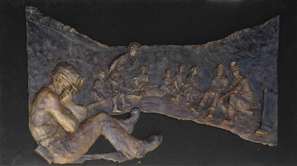
The Sago Mine exploded on January 2, 2006, killing twelve miners; one survived.  This has a formal memorial in Phillippi, although it is not complete.  The photo in this post shows Ross Straight’s flat 4’ x 6’ sculpture, with figures arranged as the bodies were found when rescuers finally reached them. 

Beth spoke with the project’s organizer who said the memorial is intended to honor all who died in the mines, but they will only list the names of the twelve who died at Sago.  According to Beth’s paraphrase, “they would never be able to fit all the miners’ names that died in coalmine accidents just in that county on a memorial.”  Today, as oil continues to gush into the Gulf of Mexico, we also remember eleven energy workers who died last month when the Deepwater Horizon drilling platform exploded.      

Vermont’s Sharon North Welcome Center on I-89 demonstrates green design with sustainable energy and water facilities.  That’s where Edee Edwards, taxonomy manager at a bio-pharmaceutical services company, found Vermont Vietnam Veterans Memorial.  This first state-sanctioned Vietnam memorial was dedicated two weeks prior to DC’s memorial.  It includes both the names of those who died and of every Vermonter who served. 

The memorial also has separate installations for those who died in Iraq and in Afghanistan.  These include not just names, but photos and remarks about their lives.  Since 1983, an all night vigil has been held every Memorial Day.  Edee said that even though she does not feel connected with the war in Vietnam, “this project ended up not just making me think, but making me feel.”

In the 90’s, the Sharon rest stop almost closed, but Vermont’s Vietnam vets lobbied to keep it open.  Ten years ago, the state selected it to be renovated as a green showcase, designed by Timothy D. Smith.  Using ground source heat pumps, the center keeps warm in the cold Vermont winter and cool in the summer, not by extraction, but by sending reclaimed water into 24 wells to return with the earth’s own heat.  Take a look at the worst oil spill in U.S. history.  Instead of stealing her blood, we should let the earth nurture us with geothermal energy.

Photo Credit:  West Virginia Governor Joe Manchin’s Photo Gallery.  Album:  Sago Mine Memorial Unveiling, May 21, 2009.


Print pagePDF pageEmail page
31
May 2010
POSTED BY
DISCUSSION 0 Comments
TAGS

Names on a Memorial: The Power of Information Arrangement

Today’s post honors Phillip Gibbs and James Green, killed shortly after midnight on May 15, 1970 by police at Jackson State College in Mississippi.  On May 4 of that year, Allison Krause, Jeffrey Miller, Sandra Scheuer, and William Schroeder were killed by the Ohio National Guard at Kent State University.

This post will also be the Memorial Day essay for Discover the Region, where some of my writings will now be published.

Like all language, organized information persuades.  It “directs our thinking,” as biologist Stephen Jay Gould wrote about classification.  Information arrangement shapes perception and interaction.  Names on memorials are examples of organized information where arrangement defines a visitor’s experience.  The thoughtful chronology of the Vietnam Veterans Memorial builds a space for individual remembrance.  A World War I memorial does the same, but with a different arrangement strategy, reflecting the difference in the two wars.  In contrast, the random arrangement proposed for the World Trade Center memorial almost derailed the project.  Yet, in another context, random builds community at the Memorial Temples of Burning Man.

By listing names on the Vietnam Veterans Memorial (VVM) in chronological order, designer Maya Lin gave surviving Vietnam Vets personal spaces for contemplation, spaces that make the VVM our most powerful memorial.  Names are arranged by date of casualty, not date of death.  Those who died later of wounds received in battle are listed on the day of the battle along with their buddies who died that day or went missing.  When a surviving soldier visits the VVM, he need only remember one name to look up in the index.  He finds the panel and sees the names of his friends who died in a battle he fought.  They remain together where he can visit them and remember his own experience.

Architect EdwinLutyens influenced Lin with his World War I Memorial to the Missing of the Somme.  This open structure of 16 huge columns, with intersecting arches and a truncated tower in Thiepval, France lists more than 72,000 names on its huge columns, names of British soldiers missing from a single battle.  Like the VVM, the memorial gives survivors an individual place of remembrance, but the two use different arrangements to achieve the same goal.  The VVM honors over 58,000 dead or missing during a 20 year war.  The Somme memorial lists those missing from a five month battle, most from a one day massacre when British troops surged into waiting German lines.

In World War I, Britain recruited Pals Battalions.  Men who signed up together could serve the entire war with their buddies.  Cities and towns mustered their own fighting units, sending them off to France with names like the Sheffield City Battalion.  On July 1, 1916, many of these towns lost nearly a generation of young men.

The names on the Somme memorial are arranged by British Army Order of Precedence.  That’s how military units appear on the parade ground.  These units came from individual towns, so the arrangement has the effect of organizing missing soldiers by their home towns.  Even today, with only a few remaining World War I vets, relatives and neighbors have their own place of remembrance.

Michael Arad, designer of New York’s National September 11 Memorial, ignored individual places of remembrance when he selected random as the arrangement.  This would have dispersed names from each company all over the monument.  Instead of a personal place to remember fallen coworkers, survivors would have had to hike to see each name.  The arrangement infuriated surviving families and they eventually refused to contribute to the memorial fund.  At that point, the design committee reconsidered and offered “meaningful adjacencies.”  Families can now place their loved one’s name within a group or next to an individual.  Many names will appear with the companies they worked for, but they might also be with special friends.  In one case, a married couple who worked at different companies will now be forever together on the memorial.

The designers of the National September 11 Memorial paid dearly for an arrangement error, losing money, prestige and the community’s good will.  They went from simplistic random to perhaps the most complex arrangement on any memorial with individualized name placement and multiple types of groupings.  If the designers had originally selected an obvious arrangement, such as geographic by floor, survivors would have had their places of remembrance.  They would not have needed strong family associations to fight against the arrangement and ultimately to fight for a more detailed names design.

In the right context, however, even random can build private spaces of remembrance.  David Best did this at Nevada’s Burning Man art festivals.  His Memorial Temples in 2001, 2002, 2003, and 2004 reflect the Somme memorial as arched open structures, topped with a tower and filled with names.  Burners inscribe the names they want to remember anywhere on the memorial.  The effect is random, but each inscription describes a private remembrance.  For the week of the festival, Burners have a personal place to grieve, a place they have chosen.  When the Temple burns on Sunday, individual memories and the combined memories of all Burners float into the evening sky.


Print pagePDF pageEmail page

Names on a Memorial: The Wittenbergplatz Concentration Camps Sign

(Today is the anniversary of the 1978 assassinations of San Francisco Mayor George Moscone and Supervisor Harvey Milk at the hands of fellow Supervisor Dan White.  It happened nine days after the Jonestown massacre and the assassination of Leo Ryan, a Bay Area Congressional Representative.  Jim Jones himself was well connected in the San Francisco political scene.  At the time, I was working in Davis, east of San Francisco near Sacramento.  I remember clearly Dianne Feinstein’s announcement of the assassinations as she became Mayor of the city.)

In my ongoing research on the arrangement of names on memorials, I am reading an excellent book by James E. Young, The Texture of Memory: Holocaust Memorials and Meaning.  It won the Jewish Book Council’s National Book Award in the Holocaust category.   I highly recommend this to anyone interested in the nature of monuments and memorials.

On p. 54, Young shows a photo and describes a memorial at the Wittenbergplatz transit station in Berlin.  A simple sign listing the names of ten concentration camps, it begins with the phrase “Places of terror that we should never forget.”  Young writes that the camps “are in no special order, other than that the German camps are listed last.” 

As an arrangement expert, I realized listing the German camps last indicates someone thought about the order of the names.  People who like to organize tend to take another step, if only for their own benefit.  So I used Wikipedia to find a pattern, building a spreadsheet of categories that might be organizing criteria, including locations, dates of operation, numbers of prisoners, and numbers of deaths.  I discovered the camps are listed in a complex order that adds meaning to our understanding of the memorial and of the Holocaust.

Camp

Country

Established

Number of Prisoners

    Deaths

Auschwitz

Poland

1940

400,000

1,100,000

Stutthof

Poland

1939

110,000

65,000

Maidanek

Poland

1941

         Extermination camp

78,000

Treblinka

Poland

1942

         Extermination camp

870,000

Theresienstadt

Czechoslovakia

1941

140,000

35,000

Buchenwald

Germany

1937

250,000

56,000

Dachau

Germany

1933

200,000

31,591

Sachsenhausen

Germany

1936

100,000

200,000

Ravensbruck

Germany

1939

150,000

90,000

Bergen-Belsen

Germany

1943

70,000

       100,000

(Data from Wikipedia’s List of Nazi-German Concentration Camps.  The number of deaths at Bergen-Belsen is not included in the Wikipedia table, but is estimated from the first paragraph in the Wikipedia article on Bergen-Belsen.)

The first four camps in the arrangement are located in Poland.  The fifth, Theresienstadt, is in Czechoslovakia, with the rest in Germany.  In Poland and in Germany, the first camp is the largest.  The remaining camps in the two countries are then listed by the date the camp was established. 

There may be several reasons for placing Poland first and Germany last.  Auschwitz is by far the largest camp, with the largest number of deaths, so placing it first in the full list is appropriate.  In addition, Germany is the host of the sign and perpetrator of the Holocaust, so the sign designers placed themselves last.Therefore Theresienstadt, the sole Czech camp, is in the middle. 

Why did the designers combine size and date as an arrangement?  If they wanted the largest camp first, why not list the rest in order by size?  I believe they wanted to avoid a hierarchy of horror.  Treblinka, which only had enough space to kill people, was not more benign because it was smaller.  Another option that would place Auschwitz first is alphabetical order.  But alphabetical order has no meaning.  Auschwitz is not first because it starts with an A.  It is first because it is the largest place of terror.

This arrangement is so complex, with three different placement strategies, that an honored Holocaust scholar did not see it.  What is the purpose of something so obscure?  Should the designers put a paragraph on the back of the sign explaining their intentions?

Memorials, even simple signs, are a form of art.  We don’t usually explain art on the piece itself.  We let viewers discover their own understanding.  Like most artists, the sign designers offered clues.  They placed Auschwitz, which begins with an A, first in a non-alphabetic arrangement.  They also set apart the three countries.  This sign is intended for Germans who would know the five camps in their own country.  The clues tell us there is some sort of arrangement here.  Young recognized this when he commented that the German camps were last. 

The Wittenbergplatz sign is at a transit station in a busy Berlin shopping area.  There may be thousands of commuters who see it every day.  If the sign were in alphabetical order, it would be stagnant.  Instead it has a structure that is implied but not obvious, an enigma perhaps adding more conscious thought to those thousands who every day see the words, “Places of terror that we should never forget.”


Print pagePDF pageEmail page

Names on a Memorial: Meaningful Adjacencies

(This post acknowledges October 12 as a day honoring Christopher Columbus, who promoted European colonization of the New World, thus beginning the desecration of North and South America’s original civilizations.)

Michael Arad, designer of the World Trade Center 9/11 memorial, originally envisioned a random name arrangement.  He felt the imposition of any organized arrangement strategy would cause “grief and anguish.”  However, it soon became clear that it was the randomization of the names that was causing the grief and anguish.    

Families of those who died understood that random trivializes life and death.  They wanted the name arrangement to indicate affiliation, such as business, friends and family, along with details including the names of the businesses, ages of the victims, and floor numbers.  Family groups fought for this vision by refusing to donate to the memorial, demonstrating the emotional power of information arrangement.  The designers  compromised with a name arrangement that is intended to look random but is actually a highly organized list of names with “meaningful adjacencies.”  This is not a simple structure with one set of arrangement rules.  Each name is placed according to individualized criteria.      

Both the Vietnam Veterans Memorial (VVM) and the Memorial to the Missing of the Somme incorporate meaningful adjacencies, as does every arrangement method, except random.  A lack of meaningful adjacencies defines random.  The VVM lists names in chronological order.  Those who died on a given date are adjacent on the memorial.  Military survivors can find friends by finding their own time of service at a designated place on The Wall. 

In France, the Somme memorial from World War I achieves the same goal with a different strategy.  Most of the 72,000 names listed on that memorial went missing on the same day, so chronology has no meaning.  These names are listed by military units, bringing people together because of recruitment by towns.  British military units in World War I often consisted of men from a single area, a method that has since been abandoned.  Whole units died during the surge on July 1, 1916.  Today, people from these towns can find their missing generation of young men in one place on the massive walls.   

These two arrangements are brilliant in their simplicity, but they organize groups whose members have similar defining characteristics.  That is not the case with the World Trade Center memorial.  People who died on September 11, 2001 were working or they were visiting a building, flying in an airplane or trying to rescue others.  They were with their co-workers, perhaps with their families, or they were alone.  They did not have a common reason for being where they died.       

When the arrangement controversy was raging, I submitted a proposal for a geographic structure and that is essentially what is being used.  It should be noted that I have no evidence that anyone read my proposal.  Arrangement by location was always an obvious option for this memorial.  My suggestion was based solidly on location to the point of listing people on airplanes by their seat assignments.  People who know each other sit next to each other, so meaningful adjacency is achieved.I also wanted the names from the towers listed by floor.  Again, people on the same floor know each other.  This method added meaning by demonstrating that most people below a certain floor escaped and most above a certain floor did not.  To my mind, a full geographic arrangement illustrates the tragedy more completely by showing where people were and who they were with when they died. 

The selected memorial design and its name arrangement include panels in two squares that surround two pools, one for each tower and the airplane that crashed into it.  The Pentagon and its airplane, the First Responders, and Flight 93 are with the South Tower.  Those who died in the 1993 attack are with the North Tower. 

In all, there are nine groups.  The title of each group is inscribed at the beginning of its associated names.  For example, “World Trade Center” appears before the names of those who died in the North or South Tower.  The names are then arranged by affiliation, which is not indicated, except for the First Responder agencies and units, who are reprieved of the need to look random.     

In general the families were not happy with this compromise.  They wanted more information next to each name, specifically age, company and floor.  My proposal would resolve company and floor, and also included ages with each name.  I want to say that the struggle here shows the folly of allowing non-organizersto develop such an important name arrangement.  People who don’t understand the impact of organized information thought up random.  But there are other factors to consider here.  Does every business want the kind of advertising that comes with being part of a tragedy?   

Once random was abandoned, the designers encouraged individual participation.  Next-of-kin could request placement near another name, a friend in the same company perhaps, or a loved one who worked for a different business.  Companies could request that names be arranged by department or work unit.  This resulting structure is therefore a puzzle for the designers to solve.  We can assume there were trade-offs. 

The names of a married couple who worked for different companies are listed together.  The couple has three affiliations – to each other and to their separate companies.  This could be resolved by taking the married couple out of their respective companies and placing them separately or by putting their two companies next to each other.  But this couple may not be the only ones in their companies with cross-corporate affiliations.
The designers were careful to hedge their promises with phrases like “to the best of our abilities.”  They understood subjective decisions would have to be made.  For example, if there has to be a choice, is it more important to put a married couple together than two best friends? 

My fully location based arrangement eliminated subjectivity.  However, the married couple would not be together forever on the memorial.  Their names would be sitting in their separate offices.  The chosen arrangement is a compromise with many mistakes, pretending to be random being especially egregious.  But individual attention to the placement of each name is a new idea in memorial name arrangement.  It came about accidentally when the families refused to let the designers abandon their responsibility to those who died.  The families didn’t get everything they wanted, but what they did get was personalized attention for each name engraved at the National September 11 Memorial and Museum.

(This post is part of a series about how names are arranged on memorial structures.  I returned to the series when I prepared an online course on Strategic Information Arrangement for Simmons College.  Other posts in the series can be found in the IsisInBlog Directory under “Names on a Memorial Series.)


Print pagePDF pageEmail page

Persuasion by Arrangement: Intended and Unintended Consequences

Arrangement persuades every day.  Lots of us pop into the grocery store for a bottle of milk.  So why is milk always at the back of the store?  That arrangement persuades us to hike through aisles of food that we only just now realize we need.  Got cookies?

The arrangement of concepts also persuades.  At the simplest level, alphabetical order implies equality and chronology implies time.  An intentional arrangement considers the needs of both user and designer to influence effective use of information.  An unintentional arrangement risks influencing users in unintended ways.

In his book Persuasive Technology: Using Computers to Change What We Think and Do, B. J. Fogg defines persuasion as “an attempt to change attitudes or behaviors or both” (p. 15).  By placing milk at the back of the store, the grocer attempts to influence buying behavior.  In the arrangement of concepts, I expand Fogg’s definition to include persuasion as reflecting a point of view.  If I use alphabetical order, I may persuade you that each item has equal value, at least in terms of the list.

Maya Lin’s Vietnam Veterans Memorial demonstrates one of the most elegant examples of persuasive arrangement.  She organized names on The Wall by date of injury, not date of death.  A soldier who died later of wounds inflicted in battle is therefore listed on the date of the battle.  His name is in alphabetical order with others who died on that day, so he is included among his buddies.  The survivors of the battle can visit TheWall and, in one section, see the names of their comrades.  This intentional arrangement persuades survivors and tourists alike to consider the fellowship of fallen soldiers.  It is one reason The Wall inspires more emotion than other memorial structures.

Maya Lin likes circles, so her chronology begins with a tall center panel and proceeds to the right as the panels descend in height.  It begins again at the farthest left of the panels, which grow to the tallest center point and the final names.  The name at the farthest right is Jessie C. Alba.  The others who died on his day are at the farthest left.

This may be an example of an unintentional arrangement decision with unintended consequences.  A theme of The Wall is comradeship among those who died together and among their friends who survived.  Because it is primarily an intentional arrangement, it obeys its own rules. Each name follows the previous name.  Last names beginning with an A signal a new day.  It is this rule that places Jessie C. Alba at the farthest end.  The others on his day are at the opposite end of The Wall, separated by 138 panels.  This separation implies the loneliness of death, which is the antithesis of The Wall’s theme of comradeship.

In the design process, it would have been a simple adjustment to move Alba’s name one place over to the farthest left panel, with the others on his day.  We do not know if that was contemplated.  The Wall is a work of art.  Each detail allows us to ponder its meaning.  Dying on a battlefield is a lonely experience, even if you are surrounded by your comrades.  But that is the opposite message from the other details on the Wall, which purposefully gather together those who died and the visitors who survived.  Intentional or not, in this one detail for Jessie C. Alba, the rules were more important than the theme.

Native Americans place one error in their artwork because only God can be perfect.  It is an intended error with an intended consequence.  Arrangement errors that go unrecognized have unintended consequences, possibly negative consequences that may defeat mission goals until the error is discovered.  Information arrangement is part of an entire message.  Take as much care with its details as you would with any other communication.


Print pagePDF pageEmail page
24
Jan 2009
POSTED BY
DISCUSSION 0 Comments
TAGS

Names on a Memorial: Lutyens at Burning Man

Memorial Day honors those who died serving our country, but we may also visit a grandmother’s grave. Throughout the year, there are opportunities to keep her memory alive. One of the most distinctive is Burning Man, a festival for building and experiencing art in the desert, with or without clothing.

Each September, Burners transform a flat empty playa near Gerlach into Black Rock City, Nevada’s third largest urban environment. After a week it disappears with the mantra, “Leave No Trace.” Nothing on the playa reveals Black Rock City’s existence until the next year. Climaxing the festival, a giant wooden Man burns the Saturday night before Labor Day in a bacchanalian rite of dance, performance art, and flames.

I attended Burning Man for six years. I have also researched name arrangement on memorials, including the Memorial to the Missing of the Somme in Thiepval, France, designed by Edwin Lutyens. When I first saw a photo of the WWI Memorial, it reminded me of Burning Man. Thiepval was an influence on Maya Lin for her Vietnam Veterans Memorial. David Best may also have studied Lutyens before building the Temple of Tears, Temple of Joy and Temple of Honor.

The Thiepval Memorial is a truncated tower with sixteen piers supporting intersected arches that increase in size for a two-story effect. In the interior, these piers hold names of 72,000 primarily British missing soldiers. Best’s Temples also featured arches, towers, multiple stories, and interior names. Constructed of scraps from manufacturing 3D dinosaur puzzles, similar to cookie dough scraps, they were feathery shrines of light and memory.

Best’s first Temple at the 2000 Burning Man, Temple of the Mind, designed with Jack Haye, was a ramshackle building not reflecting Thiepval. But in 2001, Best and Haye got serious. Their Temple of Tears (or Temple of Memory) featured a truncated tower and two arches, one on top of the other, giving the appearance of two stories. Burners wrote memorial inscriptions inside. Sunday night it made a glorious blaze of memories and dinosaur templates.

In 2002, Best, with Haye, continued building upon his own work in addition to Lutyens. The Temple of Joy had the truncated tower, the multiple story effect, and interior names, but no arches. His Temple of Honor in 2003 brought the arches back, retaining the two-story idea, with an elongated tower. Temple of Stars, Best’s final Temple in 2004, reflected only his own work, with a single story, tall tower and no arches. As always, Burners inscribed their memories into the interior. Mark Grieve designed the Temples of Dreams in 2005 and the Temple of Hope in 2006 without reference to Lutyens.

The Thiepval Memorial organizes names of the missing by regiments, rank and alphabetical order. Because British fighting units mustered into the Pals Battalions of their towns and neighborhoods, the Memorial keeps friends and relatives together. At Burning Man, the names are random, an ill advised organizational structure for memorials. Michael Arad, designer of the proposed World Trade Center Memorial, tried random. When surviving families vilified the suggestion as insulting, he reluctantly changed his easy-way-out random to a display that honors victims as friends and co-workers.

But random at Burning Man is only an appearance. Burners each carefully select a place on the Temple for their memories. They choose that place for a reason. Perhaps it reminds them of their loved ones; perhaps it’s easy to get to or a challenge to reach. Each memory remains in its sacred space until the burn on Sunday night.

Some say the Temple is a superior burn to the Man. After all, the Man always looks the same, but the Temple changes each year. The burning of the Man is an invitation to party. The Temple burn glows with memories and the reverence is real, regardless of what Burners wear or do not wear.

This year the Man is green, an obvious 2007 theme for a festival that leaves no trace. Check it out. You don’t need clothes, although costumes are a big part of the experience. Bring a tent, a shade structure, and lots of sunscreen and water. Bring those who now live only in your heart. When the Temple burns, it will carry your love into the sky.


Print pagePDF pageEmail page