
Medal of Honor Winners on the African American Civil War Memorial
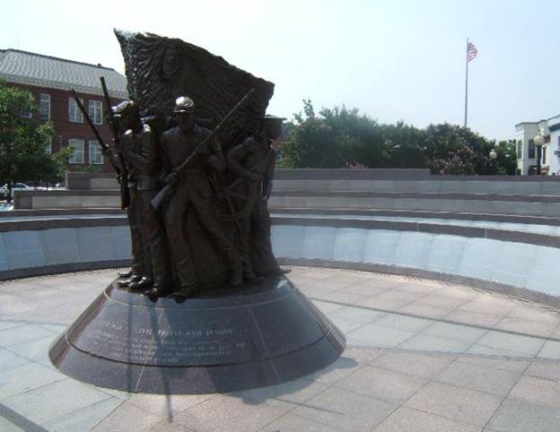
African American Civil War Memorial
Enraged by a Confederate massacre, the United States Colored Troops (USCT) and other African-American fighting troops earned 24 Medals of Honor in the years between the Battle of Fort Pillow and the end of the Civil War. Nathan Bedford Forrest enlisted in the Confederate Army when the war began and was immediately commissioned a general because he was rich, having made his fortune in the slave trade. Did he have leadership capabilities? He was responsible for one of the worst massacres in U.S. history at the Battle of Fort Pillow in Tennessee. Confederate troops murdered soldiers who had surrendered, black and white, but mostly black. Other victims may have been tortured and burned alive, including civilian women and children. Despite multiple eye witness accounts, the accusations of torture remain controversial. You can see a sanitized version of the Fort Pillow massacre in the 2016 television mini-series Roots, Part 4 (Bruce Beresford). After the war, Forrest founded the Ku Klux Klan but he lost his fortune. As an old man, preparing to die and meet his maker, he made amends with the African-American community by giving a speech promoting racial harmony.
African-American Civil War troops became ferocious after the massacre, rallying to the cry of “Remember Fort Pillow.” They fought to the death because they knew they faced torture if they didn’t. Except for William Harvey Carney’s Fort Wagner medal on July 18, 1863 and Robert Blake’s naval medal on Christmas Day, 1863 , the remaining 24 African-American and United States Colored Troops (USCT) Medals of Honor were earned in the year between Fort Pillow on April 12, 1864 and the end of the war on April 9, 1865. These men from the South experienced slavery. Those from the North experienced racism, a racism that continued in their own military as they were dying for their country. They kept fighting for freedom, a fight their descendants carried into the Civil Rights movement, a fight that inspires us even today.
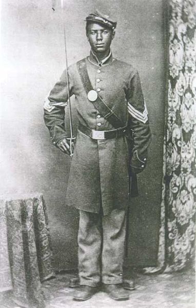
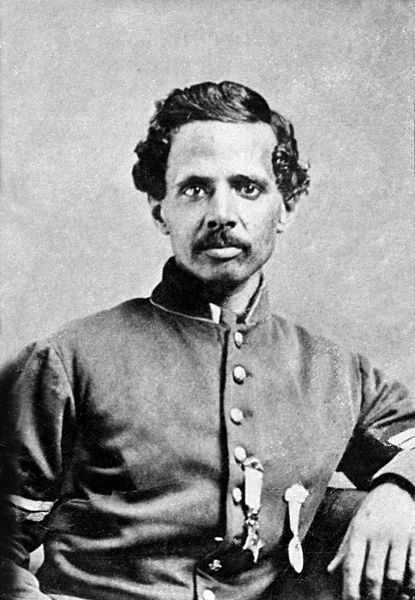
John Lawson
The Wessyngton Plantation memorial that we looked at on Memorial Day 2016 indicates which slaves joined the USCT to fight for the Union in the Civil War. A reader expressed interest in the USCT and found the African American Civil War Memorial and Museum in Washington DC which has a memorial that lists names. This memorial includes the Spirit of Freedom statue by Ed Hamilton depicting three African-American Civil War soldiers and a sailor. It is surrounded by four low walls in a semi-circle with the names of 209,145 members of the USCT and other African-American army units. African-Americans who served with white units, such as Medal of Honor winner Bruce Anderson, are not listed. Members of the Navy are also not listed. Seven African-American sailors received Medals of Honor during the Civil War: Aaron Anderson, William H. Brown, Wilson Brown, John Lawson, James Mifflin, Joachim Pease, and the first African-American to receive a Medal of Honor during the war, Robert Blake.
The names on the memorial are organized in alphabetical order within their regiments. There is no designation of rank. One of the purposes of alphabetical order is to create equality and that is the result here. In the USCT regiments, almost all of the officers were white, so organizing by rank or giving the rank with the name would build an inappropriate racial hierarchy.
The regiments are organized primarily numerically and alphabetically within each number. They begin with the 1st Regiment, USCT Cavalry, Virginia, the second being 1st Regiment, USCT Heavy Artillery, Tennessee. The state indicates where the regiment was formed. Units may have had different names originally and took new names after being incorporated into the USCT. These two can be found on panels A-1 and A-2. There are four walls, but both sides are used on the innermost wall, so the panels are designated A – E. The 157 panels number consecutively from A-1 to E-157.
The last USCT unit is the 138th Regiment, USCT Infantry, Georgia on panels E-140 and E-141. The remaining panels are not so obviously arranged. These include four military bands from Louisiana, the first being Brigade Band Number 1 Corps d’Afrique; African-American regiments that were formed early in the war and then abandoned; and state sponsored regiments that never entered the USCT.
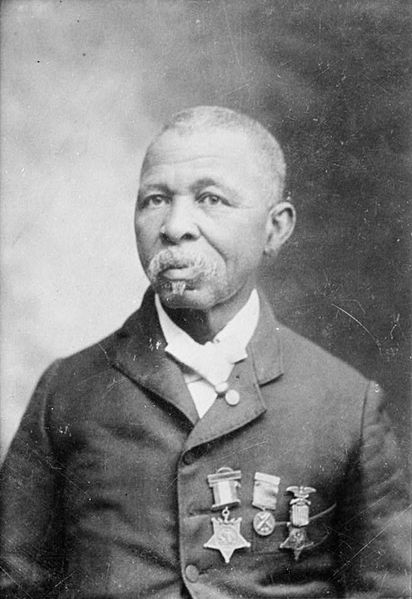
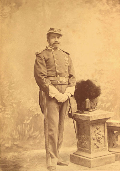
Andrew Jackson Smith
One such unit is the famous 54th Regiment, Massachusetts Cavalry (Colored), which the film Glory (Edward Zwick, 1989) was based on. This film is highly recommended for its depiction of the experiences of African-American soldiers during the Civil War. It builds up to their valiant attack on Fort Wagner in South Carolina, which, while not successful, was inspirational and encouraged other young African-American men to enlist. Massachusetts even formed another regiment, the 55th. Both claim Medal of Honor winners – Andrew Jackson Smith of the 55th at Honey Hill, South Carolina and William Harvey Carney at Fort Wagner. Carney’s action is the earliest to win a Medal of Honor for an African-American but it was issued in 1900. Smith received his medal posthumously in 2001 at a ceremony that also gave a posthumous Medal of Honor to Theodore Roosevelt for his military actions during the Spanish-Civil War. Roosevelt’s oldest son, Theodore Roosevelt Jr., earned a Medal of Honor for his actions on D-Day during World War II.
Each name on the African American Civil War Memorial is separated from the next by one of three symbols. The primary symbol is a star that simply separates the names. A circle indicates multiple records in the regiment with that name. A diamond shows this soldier may have served in other regiments, although he will only be listed once. I would like to honor the people who put together the list of names. They were dealing with fragile hand written records at least 140 years old, collected during a war.
These names can also be seen in a three volume print reference work titled Book of Names: The United States Colored Troops by Frank Smith Jr., Walter B. Hill Jr., and Hari Jones (2007). This organizes the regiments by geography: (1) The Northern States, (2) The Border States and (3) The Southern States. Each volume lists regiments by the state where they were originally formed. States and names are in alphabetical order with associated memorial panel. Within each state, the regiments are organized as on the memorial, numerically and then alphabetically. Regiments without an associated state are in the first volume. That includes the four Corps d’Afrique brigade bands presumably because Louisiana is not officially part of their names.
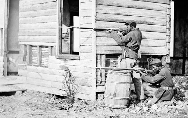
4th or 36th USCT Infantry
At the Battle of Chaffin’s Farm, also known as New Marked Heights, 15 members of the USCT, earned Medals of Honor. These soldiers were battle hardened from the siege of Petersburg in Virginia. During that action, two of the regiments, the 4th and the 5th, experienced one of the worst Union losses at the Battle of the Crater. The Union used explosives to initiate a battle but instead dug a crater from which they could not escape. Surviving Confederates simply shot down at Union soldiers in what was called a “turkey shoot.” This battle is portrayed in the film Cold Mountain (Anthony Minghella, 2003), where the action is shown from the South’s point of view. The film displays the beginning of trench warfare, a style of war that continued into World War One. Decatur Dorsey of the 39th USCT Infantry, Maryland received a Medal of Honor for his role in the battle.
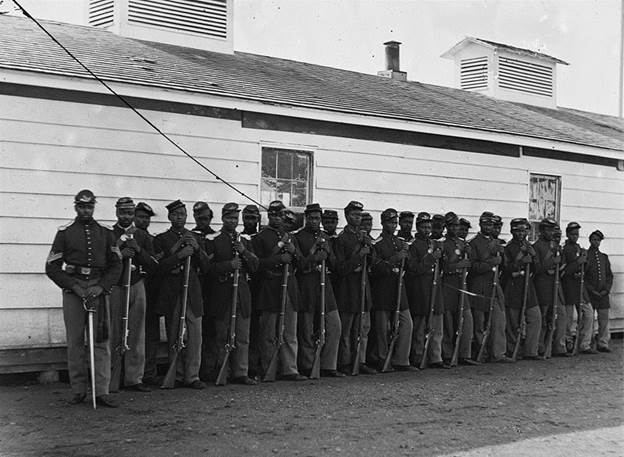
USCT soldiers at Dutch Gap
As they headed toward Chaffin’s Farm, Virginia, the 4th and 6th USCT infantry regiments participated in the action to protect the canal at Dutch Gap. After Chaffin’s Farm, the 36th Regiment returned to Dutch Gap. The photo here shows USCT soldiers at Dutch Gap. Perhaps they are members of one of these regiments.
Christian Fleetwood
Three Chaffin’s Farm Medal of Honor Winners from the 4th Regiment USCT Infantry, Maryland appear on panel A-11 – Alfred B. Hilton, Christian Fleetwood, and Charles Veale. Hilton is the only African-American Civil War Medal of Honor winner to die from wounds received in battle. Fleetwood was a diarist, so his writings provide much information about the African-American troops. Uncommon Valor: A Story of Race, Patriotism and Glory in the Final Battles of the Civil War, by Pulitzer Prize winner Melvin Claxton and Mark Puls (2006), is based in large part on his work. At the Battle of Chaffin’s Farm, Hilton carried two flags, the United States flag and the regiment flag. In the Civil War infantry, the flag bearer leads the soldiers who are trained to follow him into battle. When Hilton fell, Fleetwood and Veale picked up the flags and continued to lead the 4th Regiment into battle.
Powatan Beaty
Four more Medal of Honor winners from Chaffin’s Farm appear on panel A-14: Powhatan Beaty, James H. Bronson, Milton M. Holland, and Robert Pinn of the 5th Regiment, USCT Infantry, Ohio. All the officers from the 5th Regiment were killed and these men took over leadership.
On panel A-17, the Chaffin’s Farm Medal of Honor winners are Nathan Huntley Edgerton, Thomas R. Hawkins, and Alexander Kelly of the 6th Regiment, USCT Infantry, Pennsylvania. Edgerton was an officer. These men picked up the flags after their flag bearers fell and continued to lead the regiment into battle. Their actions are depicted in the painting “Three Medals of Honor” by the well-known modern Civil War illustrator, Don Troiani. The painting now hangs in the Union League of Philadelphia.
Two Medal of Honor winners from the 36th Regiment, USCT Infantry, North Carolina appear on panel C-51. James Daniel Gardner went ahead of his fellow soldiers and killed a Confederate officer who was urging his troops into battle. Miles James rallied his USCT troops into battle despite a serious arm injury that resulted in a battlefield amputation.
The final three USCT Medal of Honor winners from Chaffin’s Farm appear on panel C-53: William H. Barnes, James H. Harris, and Edward Ratcliff of the 38th Regiment, USCT Infantry, Virginia. These three men ran ahead of their fellow troops into the battle.
If we look at these 15 USCT Medal of Honor winners from Chaffin’s Farm, the common theme seems to be leadership. Four of them took on the responsibilities of officers who had died. The honor came for six of them because they carried the flag and therefore took their men into battle. The remaining six ran ahead of their fellow troops, also leading their men into battle.
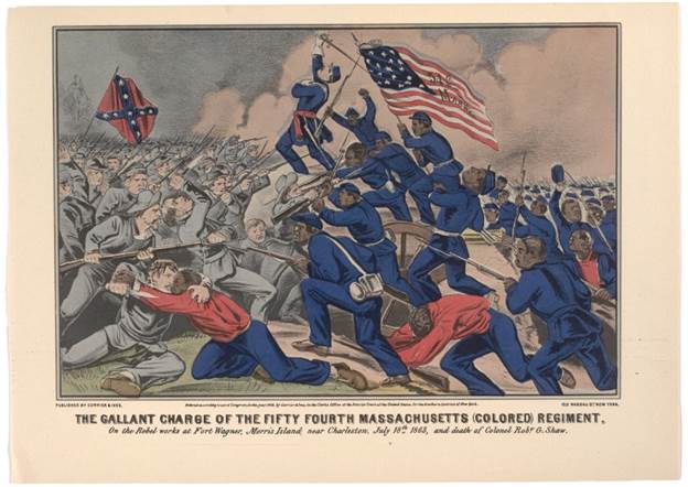
“The Gallant Charge of the Fifty Fourth Massachusetts (Colored) Infantry” by Currier & Ives. Note Union flag bearer as a leader.
Only a few African-Americans were allowed to become officers, although many did achieve non-commissioned officer status. Christian Fleetwood, the diarist, advanced as far as he could within a few weeks of enlisting. However, white enlisted men could become officers if they simply transferred over to the USCT or if, like Nathan Bedford Forrest in the Confederacy, they had a lot of money. The massacre at Fort Pillow shows the result of selecting leaders for reasons other than demonstrated skill.
The film Glory explores this theme of leadership. The character of Colonel Robert Gould Shaw (Matthew Broderick) is shown as someone who may not be prepared for this level of leadership and who grows into his role. Sergeant Major John Rawlins (Morgan Freeman) leads because he has the wisdom of age. However it is Private Silas Trip (Denzel Washington) who has natural leadership capabilities. Just about every scene involving him displays his leadership. His actions inspire Shaw to get the men new shoes. He leads the revolt for equal pay for African-Americans. Finally, in the battle to take Fort Wagner, Trip grabs the fallen flag, as did Medal of Honor winner William Harvey Carney. Unlike Trip, Carney survived and returned to camp with the flag and the words “Boys, I only did my duty; the old flag never touched the ground!”
Graphic Credits
All graphics are licensed under Creative Commons. The photo of the Memorial is from Sites of Memory. The remaining photos are from Wikimedia Commons: Lawson, Smith, Infantry (This is for the 4th Infantry. Another caption for the same photo indicates it is the 36th Infantry.), Dutch Gap, Fleetwood, Beaty, Gallant Charge


 Follow


