The First List: From Throwing to Chronology

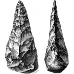
French hand axe, possibly from 500,000 BC.

In the previous post, we looked at the earliest examples of organized information.  These are primarily bone or antler artifacts with small slashes often incised over a period of time, indicating a chronologic list.  Why would our first attempts at organized information be chronologic?  Surprisingly the answer may involve our ability to throw.

I first started thinking about this after finding the work of neurophysiologist William H. Calvin, who theorized that our advanced throwing arm improved our hunting skills which in turn increased cognition.  He believes throwing at moving targets enhanced our ability to plan, thus leading to modern mental capabilities.

To bolster his argument, Calvin suggested that the ubiquitous prehistoric hand axes were actually throwing devices.  These hand axes were built and used by early humans and pre-humans for millions of years in Africa.  As hominins migrated to Europe, Asia and the Americas, they brought their flint knapping skills with them, always improving the technology, as hominins like to do.  The palm-sized tools tend to be symmetrical, narrow at the top, wide at the base, with a very sharp edge all around.

“Three wooden spears like this one were found at Schöningen, Germany.”

Several tests found the hand axes to be aerodynamic.  Calvin suggested hominins threw them into a herd of mammals, not to kill but to surprise the one that got hit.  The victim and the herd would then bolt, dispersing the animals.  In all the commotion, one of the prey might trip and that would be the one the hominins ate for dinner.

Unfortunately, Calvin was wrong about that.  The most thorough analysis of hand axes indicates they were used for butchering, not throwing.  John Mitchell, an associate of Mark Roberts at the Boxgrove site in England, had a professional butcher, Peter Dawson of Oxford, use several hand axes on a deer carcass.  Apparently if you know what you’re doing, they work great.  As Roberts stated in his book with Michael Pitts, Fairweather Eden, “Any aerodynamic properties . . . are simply incidental” (2000, p. 289).

Just because Calvin was wrong about hand axes, doesn’t mean he was wrong about brain development or throwing.  Spears from 400,000 BC were discovered by Hartmut Thieme at a site in Schoeningen, Germany.  They are made from spruce tree trunks where the hardest part is at the base of the tree.  That hardness forms the point of the spear.  The weight of the projectile is heaviest about a third of the way up the shaft, just like a modern competition javelin

As usual, these spears are controversial in terms of the date of the artifacts, the effective penetration of the projectile, and the physiological ability of pre-humans to throw.  That lack of throwing ability was challenged by a June, 2013 study in Nature.  Researchers had Harvard baseball players throw while wearing braces that replicated the mechanics of the pre-human arm and shoulder.  Their results suggest that hominins could throw accurately much earlier than previously believed.

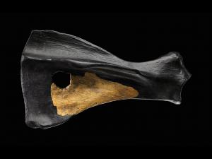
Model of pierced Boxgrove horse scapula.

The Boxgrove site is 100,000 years older than Schoeningen.  Roberts’ team didn’t find any wooden spears.  But they do have a scapula from a butchered horse with a round hole that seems to have been made by a projectile.  Forensic analysis indicates the spear was propelled with a throwing device that allowed a hominin to throw faster, farther, and harder.  This is a preliminary finding and is controversial considering that some researchers don’t believe pre-humans could even throw, let alone build a throwing device.  For now, Pitts and Roberts make this comment about the hole in the scapula, “We are not saying that it was made by a spear thrown by Man. . . . We are saying that at the moment we cannot think of any other explanation” (2000, p. 267).

So Calvin may have it right about our ability to plan a throw possibly leading to improved cognition.  But there’s more from Boxgrove about planning skills.  The researchers there, including Francis Wenban-Smith and Phil Harding, made stone hand axes themselves and discovered it’s not so easy.  Today’s Boxgrove flint knappers say it’s similar to playing chess.  You have to plan ahead five or six steps, “if you follow the path of least resistance, you will remove parts of your axe” (Pitts & Roberts, 2000, p. 298).

The artifacts at Boxgrove are from half a million years ago.  The chronologic bones and antlers of the Upper Paleolithic are only from 10,000 to 30,000 BC, plenty of time to learn how to plan.  It’s no wonder when humans were ready to leave the archaic and move on to the future, they built a chronologic planning tool.

Reference

Michael Pitts and Mark Roberts (2000).  Fairweather Eden: Life Half a Million Years Ago as Revealed by the Excavations at Boxgrove.  New York:  Fromm International.

Graphics

French hand axe, possibly from 500,000 BC.   Wikimedia Commons.  http://commons.wikimedia.org/wiki/File:Biface.jpg

“Three wooden spears like this one were found at Schöningen, Germany.”   Chip Clark, Smithsonian Institution.  http://humanorigins.si.edu/evidence/behavior/oldest-wooden-spear

Model of pierced Boxgrove horse scapula.  James Di Loreto & Donald H. Hurlbert, Smithsonian Institution.  http://humanorigins.si.edu/evidence/behavior/punctured-horse-shoulder-blade


Print pagePDF pageEmail page
22
Jul 2013
POSTED BY
DISCUSSION 0 Comments
TAGS

The First List: A Prehistoric Chronology

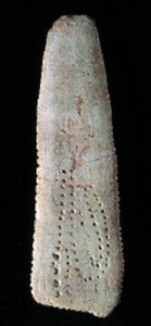
Taï Plaque

I have been hanging out in the Paleolithic trying to find the earliest example of organized information.  So far, that seems to be incised artifacts from around the time of prehistoric cave paintings, a highly creative era for Homo sapiens.  These possible recording devices, from as early as 30,000 BC, tend to be sections of bone or antler with slashes or other types of repetitive marks that look like an early form of a list.  In fact, when they were first discovered in mid-19th Century France by Édouard Lartet, they were called marques de chasse, or hunting lists, like notches on a gunslinger’s weapon.

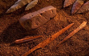
Engraved ochre from the Blombos Cave in South Africa

These engraved lists are not the earliest use of incised marks.  That honor belongs to an ochre from 78,000 BC found at Blombos Cave in South Africa.  Here the slashes seem like decoration, a design engraved because it looks nice.  It’s worth noting that the design has a repetitive symmetrical quality that may have influenced list makers 48,000 years later.  That first list was a long time coming.

In the second half of the 20th Century, Alexander Marshack, a NASA journalist turned archaeologist, innovated the use of microscopic analysis on prehistoric artifacts.  His most famous example, the Blanchard Bone (actually an antler) from about 28,000 BC, has circular marks reminiscent of the moon.  Using the microscope, Marshack (1991a) compared the Blanchard Bone and other possible lists to a lunar model he developed for the purpose.  He discovered that groups of marks on many artifacts tend to change with the moon’s cycle, particularly around the time of the dark of the moon.  So he designated these artifacts as lunar calendars.  The idea is controversial, although otherwise well researched documents accept without criticism the hunting list explanation, which is little more than a wild guess (see for example Hoffecker, 2011, p. 133).

One critic (Littauer, 1974, p. 327) included her own suggestions on how the incisions should have been arranged, “(W)hy could not these have been easily made clearer by the insertion of a gap or a vertical indicating the beginning of a new set?” Apparently this researcher didn’t realize she is the product of 32,000 years of information organization.  The prehistoric engravers invented the recording of meaningful permanent marks.  They also invented the list.  The idea of a gap between sets hadn’t yet occurred to them.  That didn’t catch on for Latin word spacing until the 7thCentury AD.

Blanchard Bone

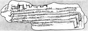
As a specialist in information organization, I find Marshack’s (1991b) discussion of the Taï Plaque, a French bone from 10,000 BC, to be the most compelling.  Although relatively recent among prehistoric engravings, this bone was incised 2,000 years before the formation of Lake Michigan.

The notches on the Taï Plaque run in parallel lines with enough daily marks to complete 3.5 years, compared with 2.25 months for the Blanchard Bone.  The engraved Taï Plaque fits into Marshack’s lunar model quite nicely; he even includes the solstice in this one.

It’s such a good fit that I believe the Taï Plaque has something to do with the moon.  However, I’m not sure if it’s a calendar or a device for recording daily events that tend to coincide with the moon.  It may be that the dark of the moon is simply a time to catch up on record keeping.

The marks on these artifacts are incised in groups, which seems to imply chronological entry or the ongoing recording of something that has already happened, perhaps even the non-lunar products of consecutive mammoth expeditions.  It could be that some artifacts are lunar calendars, some are marques de chasse, and some are anything else that needed to be recorded.

Alexander Marshack's drawing of the Taï Plaque

Lunar or not, the Taï Plaque is clearly a list.  Two of the parallel lines are incised to the very edge of the bone and then take a 90° turn so the list continues along the edge.  Did you ever do that?  On a postcard perhaps?  Not quite enough room so you write along the edge.

Marshack believed this marking along the edge was done so the solstice could be included within a line of marks.  In order for the lunar/solar explanation to work, the parallel lines would have been incised with the baustrophedon technique.  That means you read right to left on one line and left to right on the next, continuing back and forth.  It’s a method seen as late as the early alphabet.  Once spelling gets involved, the various languages tend to settle each into their own direction.  But it works quite well if all you’ve got is notches.

With the Taï Plaque, and others like it, we clearly see that the first instances of recorded  information were lists.  If Alexander Marshack was correct and these lists represent lunar notation, then the first instances of recorded information were organized structures, lists in chronological order.  Based on the concept of grouped incisions, even if Édouard Lartet was correct and the engravings recorded hunting statistics, they’re still lists in chronological order.

References

Hoffecker, John F. (2011). Landscape of the Mind: Human Evolution and the Archaeology of Thought.  New York: Columbia University Press.

Littauer, Mary Aiken; F. D. McCarthy & Alexander Marshack (1974).  On Upper Paleolithic Engraving, Current Anthropology, 15(3), 327-332.

Marshack, Alexander (1991a).  The Roots of Civilization: The Cognitive Beginnings of Man’s First Art, Symbol and Notation. (Revised and expanded).  Mount Kisco, NY: Moyer Bell Ltd.

Marshack, Alexander (1991b). The Taï Plaque and Calendrical Notation in the Upper Palaeolithic, Cambridge Archaeological Journal, 1(1), 25-61.

Graphics

Both Taï Plaques:  http://edytem.univ-savoie.fr/membres/cayla/geosite/index.php?option=com_content&view=article&id=76:la-grotte-de-thais&catid=34:france&Itemid=56

Blombos ochre:  http://commons.wikimedia.org/wiki/File:BBC-artefacts.jpg

Blanchard Bone:  http://www.cnes-observatoire.net/memoire/musee_manif/05_ndm08_espace-habite/26.html


Print pagePDF pageEmail page
10
Jul 2013
POSTED BY
DISCUSSION 0 Comments
TAGS

De Gustibus Non Est Disputandum*

(Today is the birthday of the Dalai Lama, a survivor of religious persecution.  So we honor the shrines of Timbuktu, recently demolished by religious vandals who think God wants them to destroy beauty.)

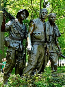
Three Soldiers

Burton Barr Central Library sits a mile or so from my house.  Named for a Phoenix politician who supported the library, this main branch still has a few microfilm readers.  That’s where I’ve settled in, immersed in the early days of the Vietnam Veterans Memorial (VVM) as documented by the Washington Post and just about every art critic in 1980’s America.

The announcement of Maya Lin’s winning design erupted into a battle between the forces of representational and non-representational art, causing the addition of an Iron Mike, the typical soldier statue erected in a town park.  Twelve years after the VVM established itself as one of the world’s great memorials, best-selling author Tom Wolfe, a representational combatant, illogically lamented the 1980’s “ludicrous lapse of taste,” while boasting of “the throngs who came annually to see” Three SoldiersFrederick Hart’s statue, of course, benefits from its proximity to Lin’s VVM.

While I respect Lin’s fight for artistic integrity, I like Three Soldiers, handsome guys in the tradition of World War II movies, a good war when President Roosevelt’s four sons all served in the military.  The statue solved another controversy.  War memorials cannot be neutral because neutrality is defined as anti-war.  Wars require promotion, PR skills honed with millenniums of practice and contradicted by the reality of a list of names.

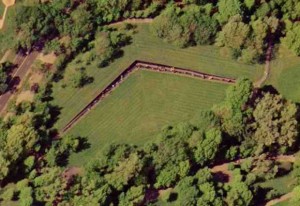
Aerial View of the Vietnam Veterans Memorial

On the memorial, the names are in chronological order by date of casualty, with each day alphabetized.  I have stated many times that chronological order and the mirrored surface allow vets to join their comrades.  But thinking about local Iron Mikes made me realize that chronological order also creates a memorial for every day of fighting in Vietnam and for every battle.  When a vet finds names from a battle he survived, he discovers a personal Iwo Jima monument.  The VVM is not just one memorial; it’s thousands of memorials.

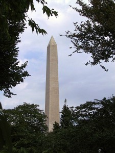
The Washington Monument

A complaint against Lin’s concept was the lack of Vietnam vets on the selection committee.  But that’s why they got this exceptional memorial.  As a consultant, I know fresh viewpoints build innovation.  Instead of learning about the Vietnam War, Lin studied other memorials with names.  She built a space to heal sorrow.  The descent into the earth and the V-shaped design, with names beginning and ending at the central vertex, all interact with the phallic Washington Monument to bring us into the comforting arms of the feminine.  The VVM is about those who died, but it was built for those who survived and for them, it’s a coming home.

* In matters of taste, there can be no disputes.

Photo Credits:  Wikimedia Commons, Three Soldiers, Vietnam Veterans Memorial, Washington M0nument


Print pagePDF pageEmail page

Arranging to Persuade: Tunneling or Guided Persuasion

Long Tunnel

Fogg’s Principle of Tunneling:  “Using computing technology to guide users through a process or experience provides opportunities to persuade along the way.”

            This month we take a journey to tunneling in our series on B. J. Fogg’s seven tools of persuasion from his book Persuasive Technology:  Using Computers to Change What We Think and Do.  Fogg cites software installation as a tunnel.  That frequently involves staying near the computer and answering questions every so often.  You are a captive audience as the installation proceeds.  As such, you may experience promotions for other products or about the benefits of your new purchase.  You and the company share a journey of software installation, with the company selecting the sights along the route.

              In his narrative, but not in his Principle, Fogg defines a tunnel as a committed journey, like an amusement park ride.  Once you sit in that gondola (or begin software installation), you’re committed to the entire journey.  In information arrangement, tunneling encompasses a wider definition.  You are enticed along a journey that you may or may not complete.  At any point you may decide what you are looking for is not worth the effort, or you may complete the journey, ending it only when you find what you are looking for.

One example of persuasive tunneling is the arrangement of a grocery store.  Many people pop into the store just for a quart of milk.  Milk sometimes goes bad suddenly so you pick it up on a quick errand.  That’s why milk is always at the back of the store.  If it was at the front, you would buy that one item and head on home.  When it’s at the back, you travel through the store aisles, experiencing other products and perhaps buying something else.

The Vietnam Veterans Memorial (VVM) provides a more complex tunnel.  Its 140 panels increase in height from 8 inches at the ends to over 10 feet in the center.  Names are inscribed in chronological order by date of casualty and alphabetical order within each day.  So it would seem that visitors take a journey from the beginning of the war to the end.

That is the case, but the journey actually begins in the center.  Maya Lin wanted the VVM to symbolize a circle so the names begin and end at the tall center panels, indicated by the only two dates on the Memorial, 1959 and 1975.  No other dates appear.  Walking along the panels, the only indication of a new day is the beginning of a new set of names in alphabetical order.  Even though this is the journey of the Vietnam War, it does not feel like a persuasive tunnel, since we only see a massive display of names.

Many visitors believe the chronology begins at the short left panel.  That’s logical since we read from left to right, not from the center to the right to the left and back again to the center.  When we experience the VVM from left to right, the shape of the memorial helps us feel the shape of war.  A few deaths at the beginning, building to a crescendo at the center and winding down to just a few names at the end.  In this case, because we know the names are in chronological order, the shape of the VVM creates a journey along the panels, persuading us to experience feelings about the progression of war.

Illustration used with permission from Microsoft.


Print pagePDF pageEmail page

Arranging to Persuade: Reduction or Persuading through Simplifying


Last month I introduced B J Fogg’s seven tools of persuasion as outlined in his book, Persuasive Technology: Using Computers to Change What We Think and Do.  I showed how information arrangement exploits these tools with specific reference to the Vietnam Veterans Memorial (VVM).  The VVM arranges its names in chronological order by date of casualty, grouping together soldiers who served at the same time.  In so doing, the memorial demonstrates six of the Fogg’s seven persuasive tools.  This month, let’s take a deeper look at the first tool, Reduction or Persuading through Simplifying.

Reduction strategy is all about cost/benefit analysis.  How much effort (cost) achieves the benefit?  Fogg describes Amazon’s 1-click ordering method as pure reduction.  Before
this innovation, every click in the online sales process was a chance for customers to change their minds.  Will they go on to the next buying step or will they give up and click over to anotherWebsite?  At Amazon, one click seals the deal.  If a mind changes later, there’s a new cost/benefit analysis for the effort involved in cancelling the order.

Many years ago, when Ma Bell stopped being our only telephone company, the new phone services battled mightily for customers.  It became very easy to change your long distance company.  One brief request and it was done.  Sometimes you didn’t even have to bother with the request.  Sign your name to some freebie promo and you might find out later that the small print was an agreement to change phone services.  One step and it didn’t even involve thinking about phones.

Maya Lin’s VVM is a more honorable example of reduction, but her controversial proposal almost didn’t get approved.  Among many complaints about Lin’s design was the chronology, which requires the use of an index to find an individual name.  Critics wanted the names on the VVM in alphabetical order, making the memorial itself a giant index. 

MIT’s John Maeda, in his book, The Laws of Simplicity, assigns organization as the second law.  Organizing arranges similar items together and simplifies our efforts to use them.  Alphabetical order on the VVM would have made it easier to find a single name, but much harder to find a group of names.

First, a vet would have to remember names from more than 30 years ago.  Then he would have to look up each name individually, walking along the panels from A – Z.  To prepare for the effort, he might alphabetize the names of his dead buddies, the ones he remembers, so he doesn’t have to move back and forth among the 144 panels.  The names near each lost friend would have no meaning other than an alphabetic
similarity, or even the same name in some cases.  Names he can’t remember would remain forgotten.  The primary memorial activity here is similar to using a print dictionary, an exercise in the alphabet rather than an emotional experience of memory.

Chronology reduces the effort and increases the depth of feeling.  The vet only has to remember one name.  He finds that name in the printed index and goes to a panel representing the time he spent in Vietnam.  There are all his friends who died or went missing.  If he can’t remember someone’s name, the memorial remembers for him.
They are together again, the vet seeing his reflection in the polished marble among the names of those he lost.  The next time he visits, he won’t need the index.  He’ll know where to find his friends. 

Illustration used with permission from Microsoft.


Print pagePDF pageEmail page

Names on a Memorial: The Power of Information Arrangement

Today’s post honors Phillip Gibbs and James Green, killed shortly after midnight on May 15, 1970 by police at Jackson State College in Mississippi.  On May 4 of that year, Allison Krause, Jeffrey Miller, Sandra Scheuer, and William Schroeder were killed by the Ohio National Guard at Kent State University.

This post will also be the Memorial Day essay for Discover the Region, where some of my writings will now be published.

Like all language, organized information persuades.  It “directs our thinking,” as biologist Stephen Jay Gould wrote about classification.  Information arrangement shapes perception and interaction.  Names on memorials are examples of organized information where arrangement defines a visitor’s experience.  The thoughtful chronology of the Vietnam Veterans Memorial builds a space for individual remembrance.  A World War I memorial does the same, but with a different arrangement strategy, reflecting the difference in the two wars.  In contrast, the random arrangement proposed for the World Trade Center memorial almost derailed the project.  Yet, in another context, random builds community at the Memorial Temples of Burning Man.

By listing names on the Vietnam Veterans Memorial (VVM) in chronological order, designer Maya Lin gave surviving Vietnam Vets personal spaces for contemplation, spaces that make the VVM our most powerful memorial.  Names are arranged by date of casualty, not date of death.  Those who died later of wounds received in battle are listed on the day of the battle along with their buddies who died that day or went missing.  When a surviving soldier visits the VVM, he need only remember one name to look up in the index.  He finds the panel and sees the names of his friends who died in a battle he fought.  They remain together where he can visit them and remember his own experience.

Architect EdwinLutyens influenced Lin with his World War I Memorial to the Missing of the Somme.  This open structure of 16 huge columns, with intersecting arches and a truncated tower in Thiepval, France lists more than 72,000 names on its huge columns, names of British soldiers missing from a single battle.  Like the VVM, the memorial gives survivors an individual place of remembrance, but the two use different arrangements to achieve the same goal.  The VVM honors over 58,000 dead or missing during a 20 year war.  The Somme memorial lists those missing from a five month battle, most from a one day massacre when British troops surged into waiting German lines.

In World War I, Britain recruited Pals Battalions.  Men who signed up together could serve the entire war with their buddies.  Cities and towns mustered their own fighting units, sending them off to France with names like the Sheffield City Battalion.  On July 1, 1916, many of these towns lost nearly a generation of young men.

The names on the Somme memorial are arranged by British Army Order of Precedence.  That’s how military units appear on the parade ground.  These units came from individual towns, so the arrangement has the effect of organizing missing soldiers by their home towns.  Even today, with only a few remaining World War I vets, relatives and neighbors have their own place of remembrance.

Michael Arad, designer of New York’s National September 11 Memorial, ignored individual places of remembrance when he selected random as the arrangement.  This would have dispersed names from each company all over the monument.  Instead of a personal place to remember fallen coworkers, survivors would have had to hike to see each name.  The arrangement infuriated surviving families and they eventually refused to contribute to the memorial fund.  At that point, the design committee reconsidered and offered “meaningful adjacencies.”  Families can now place their loved one’s name within a group or next to an individual.  Many names will appear with the companies they worked for, but they might also be with special friends.  In one case, a married couple who worked at different companies will now be forever together on the memorial.

The designers of the National September 11 Memorial paid dearly for an arrangement error, losing money, prestige and the community’s good will.  They went from simplistic random to perhaps the most complex arrangement on any memorial with individualized name placement and multiple types of groupings.  If the designers had originally selected an obvious arrangement, such as geographic by floor, survivors would have had their places of remembrance.  They would not have needed strong family associations to fight against the arrangement and ultimately to fight for a more detailed names design.

In the right context, however, even random can build private spaces of remembrance.  David Best did this at Nevada’s Burning Man art festivals.  His Memorial Temples in 2001, 2002, 2003, and 2004 reflect the Somme memorial as arched open structures, topped with a tower and filled with names.  Burners inscribe the names they want to remember anywhere on the memorial.  The effect is random, but each inscription describes a private remembrance.  For the week of the festival, Burners have a personal place to grieve, a place they have chosen.  When the Temple burns on Sunday, individual memories and the combined memories of all Burners float into the evening sky.


Print pagePDF pageEmail page

Names on a Memorial: The Wittenbergplatz Concentration Camps Sign

(Today is the anniversary of the 1978 assassinations of San Francisco Mayor George Moscone and Supervisor Harvey Milk at the hands of fellow Supervisor Dan White.  It happened nine days after the Jonestown massacre and the assassination of Leo Ryan, a Bay Area Congressional Representative.  Jim Jones himself was well connected in the San Francisco political scene.  At the time, I was working in Davis, east of San Francisco near Sacramento.  I remember clearly Dianne Feinstein’s announcement of the assassinations as she became Mayor of the city.)

In my ongoing research on the arrangement of names on memorials, I am reading an excellent book by James E. Young, The Texture of Memory: Holocaust Memorials and Meaning.  It won the Jewish Book Council’s National Book Award in the Holocaust category.   I highly recommend this to anyone interested in the nature of monuments and memorials.

On p. 54, Young shows a photo and describes a memorial at the Wittenbergplatz transit station in Berlin.  A simple sign listing the names of ten concentration camps, it begins with the phrase “Places of terror that we should never forget.”  Young writes that the camps “are in no special order, other than that the German camps are listed last.” 

As an arrangement expert, I realized listing the German camps last indicates someone thought about the order of the names.  People who like to organize tend to take another step, if only for their own benefit.  So I used Wikipedia to find a pattern, building a spreadsheet of categories that might be organizing criteria, including locations, dates of operation, numbers of prisoners, and numbers of deaths.  I discovered the camps are listed in a complex order that adds meaning to our understanding of the memorial and of the Holocaust.

Camp

Country

Established

Number of Prisoners

    Deaths

Auschwitz

Poland

1940

400,000

1,100,000

Stutthof

Poland

1939

110,000

65,000

Maidanek

Poland

1941

         Extermination camp

78,000

Treblinka

Poland

1942

         Extermination camp

870,000

Theresienstadt

Czechoslovakia

1941

140,000

35,000

Buchenwald

Germany

1937

250,000

56,000

Dachau

Germany

1933

200,000

31,591

Sachsenhausen

Germany

1936

100,000

200,000

Ravensbruck

Germany

1939

150,000

90,000

Bergen-Belsen

Germany

1943

70,000

       100,000

(Data from Wikipedia’s List of Nazi-German Concentration Camps.  The number of deaths at Bergen-Belsen is not included in the Wikipedia table, but is estimated from the first paragraph in the Wikipedia article on Bergen-Belsen.)

The first four camps in the arrangement are located in Poland.  The fifth, Theresienstadt, is in Czechoslovakia, with the rest in Germany.  In Poland and in Germany, the first camp is the largest.  The remaining camps in the two countries are then listed by the date the camp was established. 

There may be several reasons for placing Poland first and Germany last.  Auschwitz is by far the largest camp, with the largest number of deaths, so placing it first in the full list is appropriate.  In addition, Germany is the host of the sign and perpetrator of the Holocaust, so the sign designers placed themselves last.Therefore Theresienstadt, the sole Czech camp, is in the middle. 

Why did the designers combine size and date as an arrangement?  If they wanted the largest camp first, why not list the rest in order by size?  I believe they wanted to avoid a hierarchy of horror.  Treblinka, which only had enough space to kill people, was not more benign because it was smaller.  Another option that would place Auschwitz first is alphabetical order.  But alphabetical order has no meaning.  Auschwitz is not first because it starts with an A.  It is first because it is the largest place of terror.

This arrangement is so complex, with three different placement strategies, that an honored Holocaust scholar did not see it.  What is the purpose of something so obscure?  Should the designers put a paragraph on the back of the sign explaining their intentions?

Memorials, even simple signs, are a form of art.  We don’t usually explain art on the piece itself.  We let viewers discover their own understanding.  Like most artists, the sign designers offered clues.  They placed Auschwitz, which begins with an A, first in a non-alphabetic arrangement.  They also set apart the three countries.  This sign is intended for Germans who would know the five camps in their own country.  The clues tell us there is some sort of arrangement here.  Young recognized this when he commented that the German camps were last. 

The Wittenbergplatz sign is at a transit station in a busy Berlin shopping area.  There may be thousands of commuters who see it every day.  If the sign were in alphabetical order, it would be stagnant.  Instead it has a structure that is implied but not obvious, an enigma perhaps adding more conscious thought to those thousands who every day see the words, “Places of terror that we should never forget.”


Print pagePDF pageEmail page

All Things Being Equal: Sorting Articles in One Issue of a Journal

My university and public libraries both offer the E-Journal Portal service.  Enter the name of a journal and the portal shows which databases deliver full-text articles in that journal.  Each database responds to this type of search with its own display personality. The differences in their presentations have implications for intellectual honesty that demonstrate once again the necessity of organizing information with an understanding of subject parameters.      

ProQuest does this type of search best by offering a journal title drilldown, which first presents a journal page with available issues listed in reverse chronological order. Clicking a date retrieves all articles in a single issue.  Two sorting options are offered.  The default is alphabetical by article title.  A page number sort replicates the table of contents.  ProQuest’s search screen provides a different user experience.  That list of retrieved titles sorts by “most recent first” (default) or by relevance.  In the journal title drilldown, those two sorts have no value because all articles have the same date and equal relevance.  Thus ProQuest provides different sorting capabilities for the two techniques.

            Gale’s Academic OneFILE offers journal title drilldown with no sorting capabilities.  It opens with the journal page and a list of available years.  Each year expands to display its issues in reverse chronological order.  The resulting titles display in page number order, but that is not the indicated sort.  The only listed sort option is publication date, which is actually the search criterion.  With the search screen technique, relevance is added to date as a sort option.  By eliminating the relevance sort from journal title drilldown, Academic OneFile acknowledges that relevance has no value for a list of titles from a single issue, but it offers no realistic sort capabilities.  Instead results are delivered pre-sorted by page number, with the sort indicated as publication date.           

EBSCO’s journal title drilldown is similar to Academic OneFile with the first page offering a list of years that expands into issues in reverse chronological order.  However in its sorting options, EBSCO acknowledges no difference between the journal title drilldown and search screen techniques.  Its Business Source Elite and MasterFILE Premier both allow sorting by date, source and relevance for results retrieved with journal title drilldown or from the search screen.  All three sorts are useless in a list of titles from the same issue of the same journal.  Selecting any of these sorts in journal title drilldown returns a list of titles in page number order, which like Academic OneFile, is not offered as a sort option.  Business Source Elite at the academic library offers a fourth option, a valuable author sort, but the public library’s MasterFILE Premier eliminates that advantage.

OCLC’s WilsonSelectPlus does not offer journal title drilldown.  Users of E-Journal Portal are simply taken to an empty search screen.  Those who want the drilldown must try a different database.  If they stick with WilsonSelectPlus, they are rewarded with advanced sorting capabilities, but not with a one-click list of articles in a single issue. 

Both ProQuest and WilsonSelectPlus maintain their intellectual honesty in the entire process.  ProQuest offers a separate journal title drilldown with distinct sort capabilities, thus recognizing that these results have different organizational parameters than the results from a search screen.  WilsonSelectPlus does not offer journal title drilldown.  While that is disappointing, the database is honest about its capabilities.  Academic OneFile is halfway there.  It does not offer relevance sorting for a list of titles from the same issue, instead it labels a page number sort as date.  EBSCO recognizes no difference between results obtained by journal title drill down and the search screen, providing a surreal user experience as the three sorting mechanisms of date, source and relevance all return titles in page number order.        


Print pagePDF pageEmail page
13
May 2009
POSTED BY
DISCUSSION 0 Comments
TAGS

Names on a Memorial: Jessie C. Alba

(Today’s post honors Charlotte Winters, the last female U.S. veteran of World War I, who died last week at the age of 109.)

Reading the Vietnam Veterans Memorial (VVM) from left to right, like a book, Jessie C. Alba is the last name on the memorial. Because the names are listed in chronological order of casualty, visitors often think he was the last to die, but the VVM is not intended to be read like a book. 

It is intended to be experienced as a circle, with the names beginning at the center vertex and continuing east. The first half ends with Jessie, who died on May 25, 1968. Visitors then must
traverse the full length of the Wall to the far west panel for the next May 25th name, John H. Anderson. The names then proceed in chronological order, alphabetical within each date, back to the center vertex, completing the circle.

The first name for July 8, 1959, and therefore the first name at the top of Panel IE in the center vertex, is Dale R. Buis. He was watching a movie with his unit when a sniper attacked. The final names, from May 15, 1975, are on Panel 1W, one panel to the west of 1E. These eighteen died during the rescue of the S. S. Mayaguez and its crew. Richard Vandegeer is the last name on the Wall, not Jessie C. Alba.

Many first time visitors don’t get the circle metaphor, which I believe is the weakest element of the Wall. The entrance to the VVM is not in the center, but at the west or east for a linear, not a circular experience. Rather than a meaningful symbol, the circle seems like a quirk of this memorial. I’mnot complaining. Who knows what details allowed a 21 year old college student to win the VVM competition and to overcome the extreme controversy of her design? This was Maya Lin’s first major work. Some of her subsequent pieces also include circles. If she wants the beginning and the end in the middle, that’s her prerogative as the artist.

But it leaves the problem of Jessie C. Alba. Rather than the last to die, Jessie is the first name of those who died on May 25, 1968. A Texan, Sergeant Alba belonged to the Army’s 101st Airborne Division, Delta Company.  He died on the ground in Thua Thien-Hue at age 20. His is the last name on the last panel to the east, Panel 70E. The other 88 names for May 25th begin 140 panels to the west on Panel 70W.

One of the advantages of the chronology is the listing together of all names who died in a battle on a given day. I discussed this feature of the Wall in my 1/15/07 post, “Comrades in Vietnam and the Somme.” The arrangement design allows survivors of a battle to visit one area of the Wall, find their comrades and relive the experience. The Memorial to the Missing of the Somme achieves the same goal by listing regiments together. In that arrangement, the flow for three regiments is disrupted to promote Edwin Lutyens’ architecture (see my 2/4/07 post, A Path Among the Missing).

Rather than promoting architecture, I believe the Wall got caught up in its own rules — chronological order, alphabetical order within dates and no space to indicate a new date. But the VVM also has rules for keeping comrades together. Those who died of injuries are listed with the date of injury not the date of death. The missing are listed with the day they went missing. Because the first rules were slavishly followed, the intention of the second rules was lost for Jessie.

An information arrangement is built by rules – the rule of the alphabet, the rule of chronology, or something more complex. Information arrangers often get caught up in their own rules, forgetting they were created to serve a goal. When a rule becomes more important than the goal, it’s time to rethink the rules. Here’s another rule for the Wall. If one name is left hanging at the end of 70E, it can be moved to the top of 70W.

As it happens, Jessie was the only one in his unit to die on May 25, 1968. The nearest chronological deaths for Delta Company are Elroy E. Beier, May 5, 1968, on Panel 55E and Nickolas G. Garcia, April 22, 1969 on Panel 26W. Alba and Beier arrived in Vietnam on the same day, December 14, 1967. Garcia arrived on April 27, 1968, a month before Jessie died, eight days before Elroy died.

Perhaps it doesn’t matter that Jessie is all by himself on that farthest panel. His buddies probably don’t know anyone else who died on May 25, 1968. But now Jessie belongs to another group. He belongs to the group who died on that day and it does matter that he is separated by 140 panels from the other members of his group. It matters to his fiancé, Mary Ann Lopez, who wrote on the The Wall-USA, “In 1996 I got a chance to see the Vietnam wall with his name on it and since I got there at night time it was so overwhelming for me. The wall is so huge and very scary in a way. I finally found his name and how ironic it was that his name is the last one almost all by itself at the end.”


Print pagePDF pageEmail page
03
Apr 2007
POSTED BY
DISCUSSION 0 Comments
TAGS

Domain Analysis: Logic in Chronological Order

Chronological order can build timelines that illuminate the concepts within a domain.  It’s a simple and effective strategy for an initial organization of subjects that include time-based documents, such as news articles.  When materials are organized by date, the full spectrum of a topic is arranged into an easily assimilated structure that helps the organizer to understand the subject and to develop categories and select vocabulary.

Information producing events have life cycles.  A newsworthy event generates material as long as it is newsworthy.  Then we move on to the next event, which generates its own material.  When documents are organized into a chronology, the material for each event is automatically gathered together, creating a logical listing of incidents that have impacted the subject area.

A timeline generates several useful tools for domain analysis.  The process helps organizers understand the subject by articulating the issues and clarifying their evolution.  Information about one event is displayed in the order that it happened, so developments read almost like a story.  The entire group of constituent events is also arranged as a timeline and the progress of the full subject arena is visible within a specific time frame.

Following the plot of an event by reading news stories is an engaging and painless way to learn a subject.  The organizer gains knowledge about the issues and the vocabulary.  If clients contribute to the news, as participants or analysts, the timeline helps articulate their point of view, which significantly aids the development of useful categories for the client’s domain.

Obviously overlap in the timeline is inevitable.  Sometimes there are follow-up or even preliminary stories that happen outside the primary time frame, but these tend to be peripheral.  In general, the main body of documents about a given event will be written when the event is attracting the greatest interest of writers.

I used an initial chronologic construction to organize information for a save-the-carnivores environmental group that tends to operate in a reactive mode. Anytime there is a sighting in a populated area, news is generated and the group must respond.  One valuable result of my timeline was an easily accessible list of newsworthy encounters between these animals and humans.

An event impacting this group could be a newly published report on the animal or its habitat.  First the report is issued, along with promotional press releases, which generate news stories.  Then there are responses to the report by groups who like the carnivore and groups who do not like the carnivore, all of whom issue their own press releases, which generate more written material.  By now the report is big news, so there are also background stories on the issues facing the animal and the people who live in its habitat.

With this simple exercise of putting material into a chronology, I have gathered valuable resources for domain analysis into one place and automatically organized them into a logical time-based structure.  I have the report, which contains important information about the issue.  I also have press releases and news articles which summarize and analyze the report.  So I can read an entertaining news article instead of a boring report.  Then the responses of the pro and con groups give me the full spectrum of opinions.

I now have enough knowledge and data to build a category structure.  The structure can be specifically for the report or I can expand the ideas of the report into the full domain.  For example, I can build a hierarchy that defines the pro and con issues facing this animal or carnivore conservation in general.  I can also build a structure for organizations involved in the report, including the issuing agency and the pro and con responding groups.

Ultimately the initial chronological order is replaced by a more complex topic-based structure.  Putting information into order by date is easy and fast.  It’s a good way to start the organizational process because topics just fall into place.  For an organizer working with the chronology, category relationships become evident and the domain’s vocabulary is easily assimilated.  Simply arranging material into a timeline offers new knowledge about events that impact the client.  This helps the organizer interpret domain topics into structures that reflect client experiences, providing for clients a satisfying interaction with their own information.


Print pagePDF pageEmail page
08
Mar 2006
POSTED BY
DISCUSSION 0 Comments
TAGS