Arranging to Persuade: Tailoring or Persuasion Through Customization

Dress Form

Fogg’s Principle of Tailoring:  Information provided by computing technology will be more persuasive if it is tailored to the individual’s needs, interests, personality, usage context, or other factors relevant to the individual.

We are all familiar with tailored technology.  Every time you go to Amazon.com, you are presented with items selected for you based on your previous purchases.  Facebook tailors the ads you see by mining your demographic profile.  Then you have the opportunity to approve or disapprove the ad, further allowing Facebook to tailor what you see.  B. J. Fogg in Persuasive Technology: Using Computers to Change What We Think and Do, describes a site called Scorecard.  Enter your zip code and it will tell you about the pollution in your neighborhood.

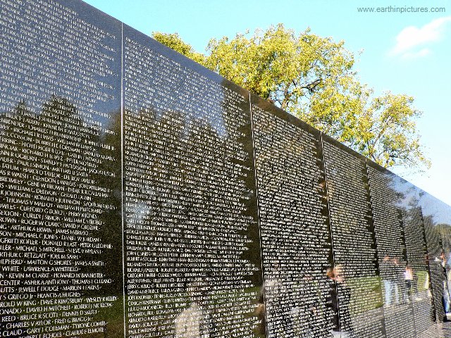
Tailoring is one of the reasons for the success of the Vietnam Veterans Memorial.  The war lasted for about 18 years with military personnel cycling in and out of Vietnam.  The names on the memorial are listed in chronological order by date of casualty, bringing together those in Vietnam at the same time.  This gives surviving veterans an individual place on The Wall.  They only have to remember one name to look up in the printed index.  When they find that person’s panel, they find their own panel because that represents their time in Vietnam.  That panel is where they see all the names of their friends who died.

When I build an organizational structure, I like to use the word perspective for tailoring.  I build the structure from the perspective of the user.  Developing a classification scheme for Trans-Pacific Geothermal, Inc. (TGI), I considered how the client would use the system.  TGI is an exploration and development company.  They’re looking for hot water in areas where they have drilling leases and they want to see all the available material about the areas they are exploring.

Geologic information tends to have the same parameters of scientific technique combined with location.  A location is selected because it’s a great place to do the science or, as in the case of TGI, the scientist is interested in the location.  TGI wanted to know everything about the areas where they had their leases or where they were considering the purchase of leases, so I organized their material by location:

State

County

Geothermal Resource Area

Science

If TGI had been doing pure scientific research, rather than exploration, I would have designed the system differently, placing science at the top, with location categories as the subsets.  This is an example of an ABBA construction.  Location can be the primary field or science can be the primary field, with the contents of the categories remaining the same.  There is no inherent hierarchy.  The hierarchy evolves to suit the perspective of the user.

Traditional library classification is not tailored.  Its goal is to classify all of human knowledge for everyone’s use.  In a typical library, geologic material may be needed by a science researcher or by an energy developer.  Catalogers can’t pick one over the other.

But you can definitely take sides when you know who your users are.  Define your clients and develop an understanding of why they interact with the material.  Then build your structure in a way that brings everything together for them.  Maya Lin used a chronology that gave all Vietnam Vets their own individual place on The Wall.  When I built a geothermal library, I used location to collect all the material my clients would want to see at the same time.

Your clients will have different needs and those needs may change as their projects proceed.  When you tailor category arrangement, you put your clients one step ahead in their work.   You can stay one step ahead of the client by including sorting capability and allowing users to do their own tailoring.


Illustration used with permission from Microsoft.


Print pagePDF pageEmail page

Arranging to Persuade: Self-Monitoring or Taking the Tedium Out of Tracking


Red Shirt

B. J. Fogg’s Principle of Self-Monitoring:  Applying computing technology to eliminate the tedium of tracking performance or status helps people to achieve pre-determined goals or outcomes.

Self-monitoring, the fifth persuasive technique from B J Fogg’s book, Persuasive Technology: Using Computers to Change What We Think and Do, includes such devices as a smart jump rope and a heart rate monitor.  As you exercise, the jump rope’s handles display the number of calories you’re burning.  The heart monitor shows the rate your heart is pumping.  Fogg explains that “this type of tool allows people to monitor themselves to modify their attitudes or behaviors to achieve a predetermined goal or outcome.”  The exercise machines at my gym have similar devices.  I sometimes pedal faster to reach a mileage goal before the end of the spinning class.

We’ve been examining how information arrangement uses Fogg’s persuasive principles at the Vietnam Veterans Memorial.  Self-monitoring is the one principle not in use at the VVM.  However, we can look at the facet-based search technique to see how self-monitoring works with this type of information arrangement.

Facets are a method for presenting the defined attributes of online records in a finite collection.  Users select and deselect attributes as the search proceeds, enabling them to monitor and modify the results.  This is especially valuable for online sales.

Let’s say you want to buy a shirt.  A clothing website displays all its available shirts with a list of facets:  color, fabric, style, etc.  You select blue, so now you only see blue shirts in available fabrics and styles.  If any fabrics or styles do not have blue, you no longer see them.  You select cotton.  Other fabrics are eliminated and you only see blue cotton shirts in the available styles.  Now you realize you want a polo shirt, but that’s not available in blue cotton.  So you modify your search by deselecting blue, retaining cotton, and choosing the polo style.  You see cotton polo shirts in the available colors, including a very nice red that you buy.

One example of this technology is the open source Project Blacklight.  Boston’s WGBH uses Blacklight for its Open Vault Media Library and Archives.  At the Open Vault search page, select a category under browse.   Now on the left under the heading “Narrow,” you’ll see a list of available facets for that category.  As you continue selecting, your choices appear at the top of the list.  You can add or remove attributes to modify the search.

Facets provide a satisfying search experience because there is no guessing.  It’s a process that searches a finite collection, only showing available items, so you always have an accurately populated screen.  As you select and deselect, you see different aspects of the collection.  If the online store doesn’t have blue polo shirts, a simple modification shows you they do have one in this nice shade of red.


Illustration used with permission from Microsoft.


Print pagePDF pageEmail page

Arranging to Persuade: Tunneling or Guided Persuasion

Long Tunnel

Fogg’s Principle of Tunneling:  “Using computing technology to guide users through a process or experience provides opportunities to persuade along the way.”

            This month we take a journey to tunneling in our series on B. J. Fogg’s seven tools of persuasion from his book Persuasive Technology:  Using Computers to Change What We Think and Do.  Fogg cites software installation as a tunnel.  That frequently involves staying near the computer and answering questions every so often.  You are a captive audience as the installation proceeds.  As such, you may experience promotions for other products or about the benefits of your new purchase.  You and the company share a journey of software installation, with the company selecting the sights along the route.

              In his narrative, but not in his Principle, Fogg defines a tunnel as a committed journey, like an amusement park ride.  Once you sit in that gondola (or begin software installation), you’re committed to the entire journey.  In information arrangement, tunneling encompasses a wider definition.  You are enticed along a journey that you may or may not complete.  At any point you may decide what you are looking for is not worth the effort, or you may complete the journey, ending it only when you find what you are looking for.

One example of persuasive tunneling is the arrangement of a grocery store.  Many people pop into the store just for a quart of milk.  Milk sometimes goes bad suddenly so you pick it up on a quick errand.  That’s why milk is always at the back of the store.  If it was at the front, you would buy that one item and head on home.  When it’s at the back, you travel through the store aisles, experiencing other products and perhaps buying something else.

The Vietnam Veterans Memorial (VVM) provides a more complex tunnel.  Its 140 panels increase in height from 8 inches at the ends to over 10 feet in the center.  Names are inscribed in chronological order by date of casualty and alphabetical order within each day.  So it would seem that visitors take a journey from the beginning of the war to the end.

That is the case, but the journey actually begins in the center.  Maya Lin wanted the VVM to symbolize a circle so the names begin and end at the tall center panels, indicated by the only two dates on the Memorial, 1959 and 1975.  No other dates appear.  Walking along the panels, the only indication of a new day is the beginning of a new set of names in alphabetical order.  Even though this is the journey of the Vietnam War, it does not feel like a persuasive tunnel, since we only see a massive display of names.

Many visitors believe the chronology begins at the short left panel.  That’s logical since we read from left to right, not from the center to the right to the left and back again to the center.  When we experience the VVM from left to right, the shape of the memorial helps us feel the shape of war.  A few deaths at the beginning, building to a crescendo at the center and winding down to just a few names at the end.  In this case, because we know the names are in chronological order, the shape of the VVM creates a journey along the panels, persuading us to experience feelings about the progression of war.

Illustration used with permission from Microsoft.


Print pagePDF pageEmail page

Arranging to Persuade: Reduction or Persuading through Simplifying


Last month I introduced B J Fogg’s seven tools of persuasion as outlined in his book, Persuasive Technology: Using Computers to Change What We Think and Do.  I showed how information arrangement exploits these tools with specific reference to the Vietnam Veterans Memorial (VVM).  The VVM arranges its names in chronological order by date of casualty, grouping together soldiers who served at the same time.  In so doing, the memorial demonstrates six of the Fogg’s seven persuasive tools.  This month, let’s take a deeper look at the first tool, Reduction or Persuading through Simplifying.

Reduction strategy is all about cost/benefit analysis.  How much effort (cost) achieves the benefit?  Fogg describes Amazon’s 1-click ordering method as pure reduction.  Before
this innovation, every click in the online sales process was a chance for customers to change their minds.  Will they go on to the next buying step or will they give up and click over to anotherWebsite?  At Amazon, one click seals the deal.  If a mind changes later, there’s a new cost/benefit analysis for the effort involved in cancelling the order.

Many years ago, when Ma Bell stopped being our only telephone company, the new phone services battled mightily for customers.  It became very easy to change your long distance company.  One brief request and it was done.  Sometimes you didn’t even have to bother with the request.  Sign your name to some freebie promo and you might find out later that the small print was an agreement to change phone services.  One step and it didn’t even involve thinking about phones.

Maya Lin’s VVM is a more honorable example of reduction, but her controversial proposal almost didn’t get approved.  Among many complaints about Lin’s design was the chronology, which requires the use of an index to find an individual name.  Critics wanted the names on the VVM in alphabetical order, making the memorial itself a giant index. 

MIT’s John Maeda, in his book, The Laws of Simplicity, assigns organization as the second law.  Organizing arranges similar items together and simplifies our efforts to use them.  Alphabetical order on the VVM would have made it easier to find a single name, but much harder to find a group of names.

First, a vet would have to remember names from more than 30 years ago.  Then he would have to look up each name individually, walking along the panels from A – Z.  To prepare for the effort, he might alphabetize the names of his dead buddies, the ones he remembers, so he doesn’t have to move back and forth among the 144 panels.  The names near each lost friend would have no meaning other than an alphabetic
similarity, or even the same name in some cases.  Names he can’t remember would remain forgotten.  The primary memorial activity here is similar to using a print dictionary, an exercise in the alphabet rather than an emotional experience of memory.

Chronology reduces the effort and increases the depth of feeling.  The vet only has to remember one name.  He finds that name in the printed index and goes to a panel representing the time he spent in Vietnam.  There are all his friends who died or went missing.  If he can’t remember someone’s name, the memorial remembers for him.
They are together again, the vet seeing his reflection in the polished marble among the names of those he lost.  The next time he visits, he won’t need the index.  He’ll know where to find his friends. 

Illustration used with permission from Microsoft.


Print pagePDF pageEmail page

Arranging to Persuade: Seven Persuasive Tools


The Vietnam Veterans Memorial (VVM) is arguably the most powerful memorial in the world.  Maya Lin’s choice of chronological order for name arrangement may be the primary element of that power.  In making that choice, she engaged six of the seven persuasive tools identified by B J Fogg, in his book, Persuasive Technology:  Using Computers to Change What We Think and Do.  Along with technology, Fogg’s tools explain the persuasive aspects of information arrangement.  He defines a persuasive technology tool as one “designed to change attitudes or behaviors or both by making desired outcomes easier to achieve.”  He further divides these into macrosuasion and microsuasion.  The only purpose of a macrosausive tool is to persuade.  For example, the museum exhibit and computer game HIV Roulette persuades players to practice safer sex.

Microsuasive tools are the persuasive components of technologies whose primary purpose is other than persuasive.  The primary purpose of the VVM is to honor those who died or went missing during that war.  The chronologic arrangement changes the attitude and behavior of visiting Vietnam vets by allowing them to experience their time of service as they stand in front of the names of their lost buddies.

Information arrangement is almost always microsuasive.  Following are Fogg’s seven tools with an explanation of how the VVM uses them.  This is an article about arrangement, so I will mention that the tools appear in the same order in which they appear in Fogg’s book.

1)  Reduction:  Persuading through Simplifying  

People are more likely to complete a simple task.  Amazon offers“one-click” sales.  Press the key once and the sale is complete.  You can change your mind after that, but it’s a hassle.  If the names on the VVM were in alphabetical order, each name would have to be remembered and found individually.  But with chronology, a vet need only retrieve one name from his decades of memory.  The printed index shows where that name is on The Wall, surrounded by others who died on the same day, in the same battle.

2)  Tunneling:  Guided Persuasion 

In the journey of software installation, with a captive audience, the producer may demonstrate product features or try to sell more software.  The VVM also takes us on a journey.  Symbolized as a circle, the chronology begins and finishes in the center of the memorial.  Panel sizes, small at the two exteriors and huge in the center, encourage the view of a journey into a war that started small and grew and eventually ended.

3)  Tailoring:  Persuasion through Customization 

Shopping sites customize the buying experience by offering products based on previous purchases.  The VVM’s chronology gives each surviving Vietnam vet a personal place of remembrance on the memorial.  The names of his buddies will always be in that one location, a location he can return to again and again.       

4)  Suggestion:  Intervening at the Right Time 

Traffic trailers that give your speed as you drive by provide a suggestion at the appropriate moment, while you are driving.  The appropriate moment at the VVM is the occasion of a visit.  Any memorial’s purpose is to encourage thoughts about the memorialized event.  Because the VVM names are in a chronology, vets easily find their friends in one place, eliciting more memories with deeper thoughts.

5)  Self-Monitoring:  Taking the Tedium Out of Tracking 

Self-monitoring technologies include pedometers that record steps taken in a day.  This persuasive tool is not included at the VVM.  One information arrangement technique that does involve self-monitoring is the use of facets.  Let’s say a clothing site offers selection by the attributes (facets) of its products.  A user may first select gender, with the system only displaying products that meet the selection.  The user then selects shirts, changing the display to only available shirts in that gender.  Size may be selected next, etc.  Users self-monitor by evaluating the results of their choices as they proceed.

6)  Surveillance:  Persuasion through Observation

We are all familiar with the announcement that our conversation with a call center may be monitored.  Obviously the call center employee knows this too.  I have not yet seen an information arrangement example of surveillance.  However there is a form of surveillance at the VVM. Visitors leave items everyday at the base of the panels.  These are gathered by the Park Service, cataloged and placed in storage. Knowledge that the offerings become part of the historic record encourages this tradition.

7)  Conditioning:  Reinforcing Target Behaviors  

As positive reinforcement, an online game may award points or prizes to keep people playing the game.  Chronological order at the VVM offers positive reinforcement by helping vets remember their time of service and their friends who died.  These are intimate emotions the vet may want to have again, so the arrangement itself encourages him to continue visiting.

Conditioning, of course, can also be negative.  With information arrangement, negative reinforcement may be inadvertent.  If, for example, alphabetical order had been selected for the VVM, it would just be another list of names, with nowhere near the power of chronology.  But in a different situation, it could be the alphabet that provides the persuasive element.  Like all communication, persuasion changes with context.

Illustration used with permission from Microsoft.


Print pagePDF pageEmail page

Names on a Memorial: The Power of Information Arrangement

Today’s post honors Phillip Gibbs and James Green, killed shortly after midnight on May 15, 1970 by police at Jackson State College in Mississippi.  On May 4 of that year, Allison Krause, Jeffrey Miller, Sandra Scheuer, and William Schroeder were killed by the Ohio National Guard at Kent State University.

This post will also be the Memorial Day essay for Discover the Region, where some of my writings will now be published.

Like all language, organized information persuades.  It “directs our thinking,” as biologist Stephen Jay Gould wrote about classification.  Information arrangement shapes perception and interaction.  Names on memorials are examples of organized information where arrangement defines a visitor’s experience.  The thoughtful chronology of the Vietnam Veterans Memorial builds a space for individual remembrance.  A World War I memorial does the same, but with a different arrangement strategy, reflecting the difference in the two wars.  In contrast, the random arrangement proposed for the World Trade Center memorial almost derailed the project.  Yet, in another context, random builds community at the Memorial Temples of Burning Man.

By listing names on the Vietnam Veterans Memorial (VVM) in chronological order, designer Maya Lin gave surviving Vietnam Vets personal spaces for contemplation, spaces that make the VVM our most powerful memorial.  Names are arranged by date of casualty, not date of death.  Those who died later of wounds received in battle are listed on the day of the battle along with their buddies who died that day or went missing.  When a surviving soldier visits the VVM, he need only remember one name to look up in the index.  He finds the panel and sees the names of his friends who died in a battle he fought.  They remain together where he can visit them and remember his own experience.

Architect EdwinLutyens influenced Lin with his World War I Memorial to the Missing of the Somme.  This open structure of 16 huge columns, with intersecting arches and a truncated tower in Thiepval, France lists more than 72,000 names on its huge columns, names of British soldiers missing from a single battle.  Like the VVM, the memorial gives survivors an individual place of remembrance, but the two use different arrangements to achieve the same goal.  The VVM honors over 58,000 dead or missing during a 20 year war.  The Somme memorial lists those missing from a five month battle, most from a one day massacre when British troops surged into waiting German lines.

In World War I, Britain recruited Pals Battalions.  Men who signed up together could serve the entire war with their buddies.  Cities and towns mustered their own fighting units, sending them off to France with names like the Sheffield City Battalion.  On July 1, 1916, many of these towns lost nearly a generation of young men.

The names on the Somme memorial are arranged by British Army Order of Precedence.  That’s how military units appear on the parade ground.  These units came from individual towns, so the arrangement has the effect of organizing missing soldiers by their home towns.  Even today, with only a few remaining World War I vets, relatives and neighbors have their own place of remembrance.

Michael Arad, designer of New York’s National September 11 Memorial, ignored individual places of remembrance when he selected random as the arrangement.  This would have dispersed names from each company all over the monument.  Instead of a personal place to remember fallen coworkers, survivors would have had to hike to see each name.  The arrangement infuriated surviving families and they eventually refused to contribute to the memorial fund.  At that point, the design committee reconsidered and offered “meaningful adjacencies.”  Families can now place their loved one’s name within a group or next to an individual.  Many names will appear with the companies they worked for, but they might also be with special friends.  In one case, a married couple who worked at different companies will now be forever together on the memorial.

The designers of the National September 11 Memorial paid dearly for an arrangement error, losing money, prestige and the community’s good will.  They went from simplistic random to perhaps the most complex arrangement on any memorial with individualized name placement and multiple types of groupings.  If the designers had originally selected an obvious arrangement, such as geographic by floor, survivors would have had their places of remembrance.  They would not have needed strong family associations to fight against the arrangement and ultimately to fight for a more detailed names design.

In the right context, however, even random can build private spaces of remembrance.  David Best did this at Nevada’s Burning Man art festivals.  His Memorial Temples in 2001, 2002, 2003, and 2004 reflect the Somme memorial as arched open structures, topped with a tower and filled with names.  Burners inscribe the names they want to remember anywhere on the memorial.  The effect is random, but each inscription describes a private remembrance.  For the week of the festival, Burners have a personal place to grieve, a place they have chosen.  When the Temple burns on Sunday, individual memories and the combined memories of all Burners float into the evening sky.


Print pagePDF pageEmail page

Practice What You Preach: Manipulating First Place

In my previous post, “Creative Literary and Pragmatic Lists”, I indicated that one creative component of a pragmatic list is the selection of a category to sit in first place.  When I added the essay to my “Directory of Postings,” I realized my first place was “Arrangement Structures > Alphabetical Order.”

Of all arrangement structures, alphabetical order is certainly the most boring.  In addition, there are people, some in the information industry, who hate alphabetical order.  They feel it has no meaning, which of course is its beauty.  But do I really want my first category to be something that is both boring and controversial?

So I need to put a category in front of “Alphabetical Order,” which is not so easy.  My Directory is hierarchical with categories alphabetized.  If I keep “Arrangement Structures” as the first major category, I need a structure that appears earlier in the alphabet than “Al.”  There ain’t one.  The alphabet is alpha.  The word is based on the Greek word for “A.”  It’s supposed to be first, which is one way it keeps its primacy.

The next idea places a different major category into first place.  It has to fit in the alphabet before “Arrangement Structures.”  My second major category is “Arrangement Theory.”  I need a word for theory that begins with a letter before “S.”  That word is “Principles.”

My first category is now “Arrangement Principles > Categories.”  Not controversial, but not very sexy either.  So I look at the first few categories of arrangement principles:

Categories
Findability
Information
Architecture
Knowledge
Development
Parameters
Perspective
Persuasive
Strategies

I could find a synonym for categories, but “Findability” is not very sexy either.  The sexiest is “Persuasive Strategies,” a phrase I use often so I can’t change it.  Then I realize all I have to do is put “Arrangement” in front of a category and my problem is solved.

Unfortunately, “Arrangement Persuasive Strategies” is awkward and changes a phrase I use often.  “Findability,” “Information Architecture,” and “Knowledge Development” also awkward, plus lots of people work in those areas.  I want to feature something where I am the primary practitioner.

That brings us to “Parameters” and “Perspective.”  “Arrangement” fits nicely in front of both.  But “Parameters” is a little amorphous.  I use it to represent the sometimes odd characteristics that must be considered in an arrangement.  For example, in “Working with Parameters,” a post about my client Snoopy, I discuss building an arrangement around Bloglines’ inability to accurately display spreadsheets.

Which leaves “Arrangement Perspective.”  How delightful.  I always promote designing arrangements from the perspective of the user.  And there’s an added bonus, a double meaning.  “Arrangement Perspective” could also mean my perspective on arrangement, which is what IsisInBlog is all about.              


Print pagePDF pageEmail page

Creative Literary and Pragmatic Lists

Umberto Eco’s four month Louvre exhibit about lists finished its run in February.  So if you want to see his “Mille e tre,” exhibit, you’ll have to get the beautiful catalog, The Infinity of Lists, with essays by Eco about the history of lists, along with examples of literary lists and photos of lists in visual art.  One shows a painting of edible vegetation combined to make a realistic human face with a zucchini nose (p. 130).

Following the trail of Eco’s footnotes, I found a delightful book about literary lists by Robert E. Belknap, The List: The Uses and Pleasures of Cataloguing.  Belknap distinguishes between literary lists and pragmatic lists, the type usually made by my readers.

We expect creativity in literature and lists are no exception.  Here’s an example from Tom Sawyer identifying the contents of Tom’s pockets as “a lump of chalk, an indiarubber ball, three fish hooks, and one of that kind of marbles known as a ‘sure ‘nough crystal’” (Belknap, p. 17).  Belknap shows how Twain’s language enhances each object, with the marble given “the privileged, anchoring, final spot” (p. 18).

We don’t usually think of pragmatic lists as creative. Yet they are composed of words and any use of words has a creative component.  Just think about placement, which Twain used for the marble.  In a pragmatic list, the first item holds the privileged spot.  First place may be anointed through an accident of the alphabet.  It might also be an example of what Belknap calls deliberate arrangement.  Even in alphabetical lists, first place can be deliberate.  Words have synonyms and some of those synonyms start with an A.

Here’s where we begin to see the connection between literary and pragmatic lists.  They both communicate.  The literary list communicates the author’s intentions and, in many cases, so can the pragmatic list.  If you are the author of a pragmatic list, what are your intentions for the list?  What do you want to give your readers?  The answers will help you build a deliberate arrangement that intentionally communicates. ~


Print pagePDF pageEmail page

Persuasion by Arrangement: Intended and Unintended Consequences

Arrangement persuades every day.  Lots of us pop into the grocery store for a bottle of milk.  So why is milk always at the back of the store?  That arrangement persuades us to hike through aisles of food that we only just now realize we need.  Got cookies?

The arrangement of concepts also persuades.  At the simplest level, alphabetical order implies equality and chronology implies time.  An intentional arrangement considers the needs of both user and designer to influence effective use of information.  An unintentional arrangement risks influencing users in unintended ways.

In his book Persuasive Technology: Using Computers to Change What We Think and Do, B. J. Fogg defines persuasion as “an attempt to change attitudes or behaviors or both” (p. 15).  By placing milk at the back of the store, the grocer attempts to influence buying behavior.  In the arrangement of concepts, I expand Fogg’s definition to include persuasion as reflecting a point of view.  If I use alphabetical order, I may persuade you that each item has equal value, at least in terms of the list.

Maya Lin’s Vietnam Veterans Memorial demonstrates one of the most elegant examples of persuasive arrangement.  She organized names on The Wall by date of injury, not date of death.  A soldier who died later of wounds inflicted in battle is therefore listed on the date of the battle.  His name is in alphabetical order with others who died on that day, so he is included among his buddies.  The survivors of the battle can visit TheWall and, in one section, see the names of their comrades.  This intentional arrangement persuades survivors and tourists alike to consider the fellowship of fallen soldiers.  It is one reason The Wall inspires more emotion than other memorial structures.

Maya Lin likes circles, so her chronology begins with a tall center panel and proceeds to the right as the panels descend in height.  It begins again at the farthest left of the panels, which grow to the tallest center point and the final names.  The name at the farthest right is Jessie C. Alba.  The others who died on his day are at the farthest left.

This may be an example of an unintentional arrangement decision with unintended consequences.  A theme of The Wall is comradeship among those who died together and among their friends who survived.  Because it is primarily an intentional arrangement, it obeys its own rules. Each name follows the previous name.  Last names beginning with an A signal a new day.  It is this rule that places Jessie C. Alba at the farthest end.  The others on his day are at the opposite end of The Wall, separated by 138 panels.  This separation implies the loneliness of death, which is the antithesis of The Wall’s theme of comradeship.

In the design process, it would have been a simple adjustment to move Alba’s name one place over to the farthest left panel, with the others on his day.  We do not know if that was contemplated.  The Wall is a work of art.  Each detail allows us to ponder its meaning.  Dying on a battlefield is a lonely experience, even if you are surrounded by your comrades.  But that is the opposite message from the other details on the Wall, which purposefully gather together those who died and the visitors who survived.  Intentional or not, in this one detail for Jessie C. Alba, the rules were more important than the theme.

Native Americans place one error in their artwork because only God can be perfect.  It is an intended error with an intended consequence.  Arrangement errors that go unrecognized have unintended consequences, possibly negative consequences that may defeat mission goals until the error is discovered.  Information arrangement is part of an entire message.  Take as much care with its details as you would with any other communication.


Print pagePDF pageEmail page
24
Jan 2009
POSTED BY
DISCUSSION 0 Comments
TAGS

Stealth Organizing

With evacuees arriving at the Phoenix airport, a local radio station announced Katrina Donation Day.  I was looking for a way to help and it was easy enough to pack a box of clothes for the New Orleans refugees.  To give a little extra, I joined the bucket brigade in the station parking lot and helped load the truck – lots of clothing, also toys, baby stuff, toiletries, hygiene items.  The hygiene woke me up, a box filled with necessities that have been in my bathroom cabinet since childhood.  That’s when I realized the enormity of losing everything and I knew I could make a difference in the rescue.

I’m an organizer.  I usually organize ideas, but I can organize stuff.  The hurricane rescue effort in Phoenix was receiving massive amounts of donated items.  They could probably use some organizing expertise.  I started phoning the next day and was put on waiting lists.  To be effective, I had to get started soon.  Organizing initiatives work best when they happen at the beginning of a project.  So I kept calling.  Eventually someone understood the value of my offer.  At Salvation Army headquarters, they gave me a badge and sent me to evacuee housing.  It was now Monday afternoon, Labor Day, 2005.

The strategy was for evacuees to tell caseworkers what clothing they needed.  The caseworkers then searched for the right sizes in a free store arranged like a thrift store, with clothing divided by major categories, but not by size.  When I arrived, volunteers were emptying large warehouse boxes and hanging clothes on sales racks.  I positioned myself in their area for a full view of the entire operation and started sorting.  One of the volunteers, The Boss, came over to give me instructions, which I followed as I continued to survey the situation.

One key to a successful organizing project is finding a component with high return on investment (ROI).  The investment is the organizing expense, in this case, time and energy.  For my purposes, hanging up clothes had a low ROI because inconsistent size labeling forced a careful examination of each item.  The clothing in these categories was also few enough to be eyeballed by a caseworker.  I started looking for a fast win, an easy to organize section where caseworker frustration was high.  They were pawing through jumbled heaps of underwear and mounds of shoes trying to find sizes.  Underwear would be a huge project, but at least it was divided by sex.  Not so for shoes, which was also a more manageable quantity.  That’s where I started, working into the evening dividing shoes by sex and size.

The next morning I established authority by arriving early with supplies from home – blank paper, marking pens and tape.  The first task was labeling the now organized shoes.  When The Boss showed up around mid-morning and saw me already there, she knew I wouldn’t be following her instructions anymore.  About the time I finished the shoes, a large shipment of khaki pants arrived, neatly folded and stapled with conforming labels.  Big ROI there.  Evacuees were requesting work clothes for job interviews.  I located some unused tables, set up a staging area, and sorted pants like a deck of cards.  The thrift store was now beginning to feel like a shopping mall jeans store. Caseworkers just walked up to the correct size and took what they needed.

Returning from a break, I found my staging area commandeered for a thrift store category.  The Boss gave me a significant look, but she had not undone the organized khakis.  I wasn’t there for territorial skirmishes, so I walked over to the intimidating pile of women’s underwear.  Caseworkers, getting accustomed to efficiency, were complaining about sizes.  The first sort separated panties from socks.  That required finding empty boxes, refilling the boxes, and maneuvering them within a small space.  By the time everything was prepped, it was already evening.  Size sorting would begin tomorrow.

I arrived early again, but this day The Boss didn’t show and the organizing effort really got established.  After taping size labels to the wall, I began sorting the women’s underwear.  I got into the zone, the organizing zone.  It took all day, with caseworkers searching the collection as I worked.  At one point, I turned around and saw a guy organizing the men’s underwear.  About an hour later a group of new volunteers came up to me and asked what they could do to help.  I showed them the women’s socks.  When I finished the panties in the late afternoon, I took another visual survey.  All volunteers were organizing.  Caseworkers were finding what they needed without assistance.  Size labels on the wall displayed the organized nature of this facility.  In two and a half days, I turned a thrift store into a distribution center.  I did it without disrupting the rescue effort or even requesting assistance.


Print pagePDF pageEmail page
16
Nov 2008
POSTED BY
DISCUSSION 0 Comments
TAGS